Composition
Composition is one of the most challenging yet powerful and exciting aspects of 2-D design.
It is the technical
foundation of your image. Without it, images visually fall apart.
Photo composition is the foundation upon which we build our images by the correct selection, arranging, organizing and combining the visual elements within the picture area to produce a harmonious and pleasing work.
Work out your
composition early, moving yourself or elements around until the arrangement is
pleasing to you. Making major changes and adjustments later in the design
process is much more difficult.
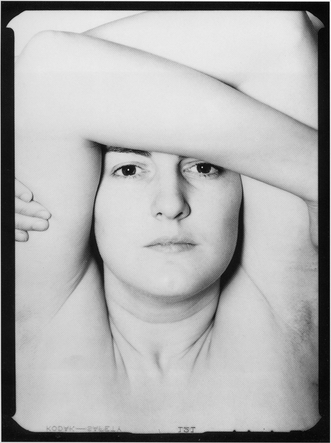
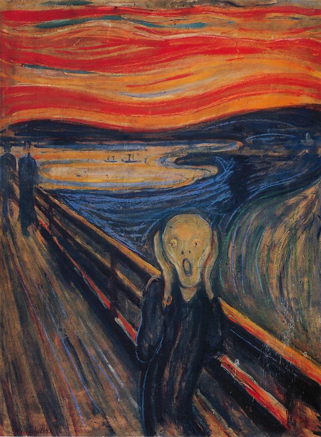
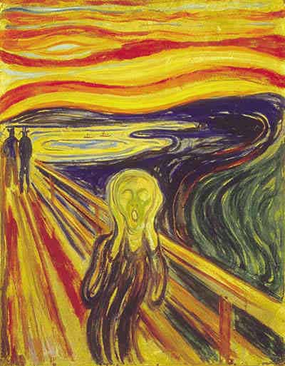
Bull's Eye Composition
 A definite ‘NO, NO’
in good composition.
A definite ‘NO, NO’
in good composition.
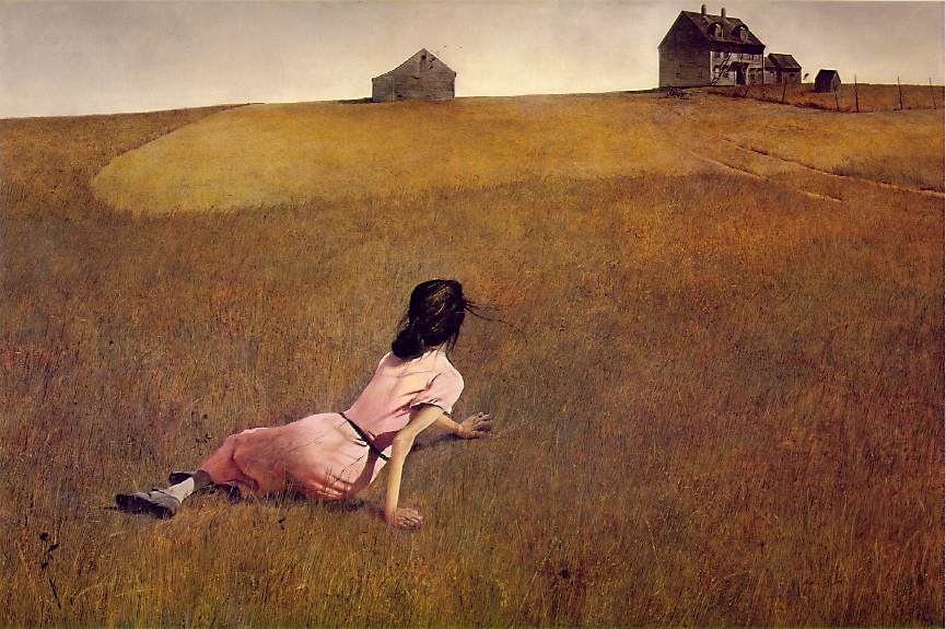
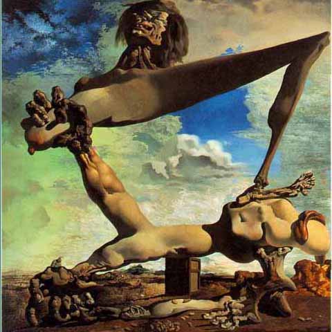
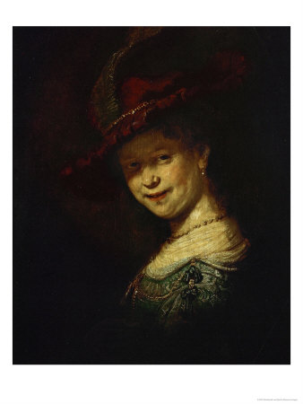
When you place the Main Subject right ‘smack’ in the center of the picture area it is called a Bull’s Eye.
 This should be avoided
at all times, unless you have a definite reason for doing it.
This should be avoided
at all times, unless you have a definite reason for doing it.
With the main
subject in the center of the picture frame the eye will go in to the picture and
stay in the center of the frame looking at the Bull’s Eye/Main Subject and
will not move around in the picture to see and enjoy any other items. The eye
will get tired very fast and lose interest in the photograph.
Your purpose in making images is to have people look at them, enjoy them, talk
about them and buy them. If they cannot get interested in a image they will not
bother to look at it and will definitely not buy it.
It is best to always have the Main Subject OFF CENTER. Even if it is just a
little Off Center it will improve the picture’s composition.
Proportion - Rule of Thirds
Proportion refers the size relationship of visual elements to each other and to the whole picture. One of the reasons proportion is often considered important in composition is that viewers respond to it emotionally. Proportion in art has been examined for hundreds of years, long before photography was invented. One proportion that is often cited as occurring frequently in design is the Golden mean or Golden ratio.

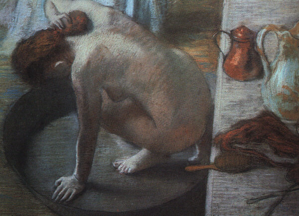
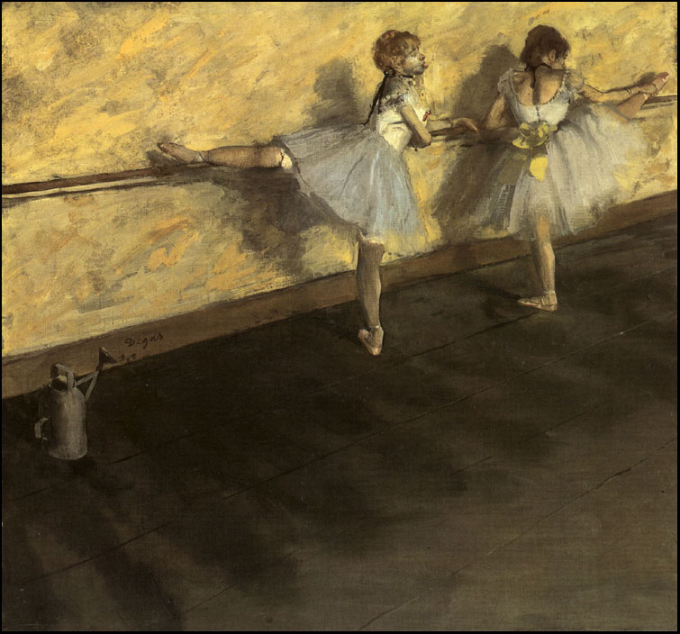
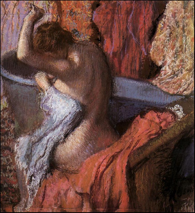
 Edgar Degas L'etoile
1876-77
Edgar Degas L'etoile
1876-77
Imagine you're shooting a landscape and
there's an isolated farmhouse in the distance or a single tree in the middle of
a field, acting as the main focal point. Most photographers would stick this
subject in the centre of the frame - which can work in some situations. However,
you will generally get a more pleasing sense of balance if you position it using
the rule-of-thirds.
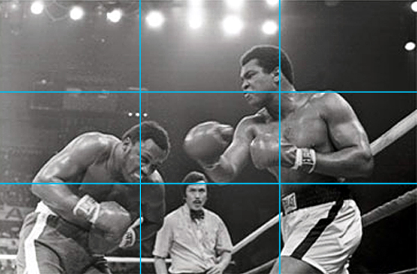
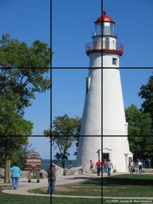
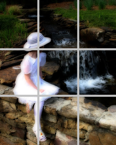
To do this, divide-up your camera's viewfinder into an imaginary grid using two
horizontal and two vertical lines. The focal point is then placed on or near any
of the four intersection points created by those lines.
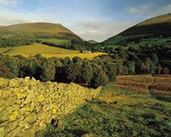
The rule of thirds can also be used to help you position the horizon. It's
tempting to stick it across the center of the frame, but unless you're shooting
a symmetrical scene, such as reflections in a lake, the result tends to look
very static and lifeless.
A much better approach is to place the horizon one third from the top or the
bottom of the frame, so you're emphasizing either the sky or ground. To help you
achieve this, divide the viewfinder into thirds using two imaginary horizontal
lines, then compose the scene before you so the horizon falls on one of them.
You should never force a picture to comply with the rule-of-thirds, but when
used with care it can work well and after a while you will find yourself
naturally dividing the scene into thirds to aid the position of important
elements.


 sgrais
Make the most of lines
Lines just can't be beaten when it comes to adding depth and dynamism to a picture. As well as creating a strong sense of direction, they also carry the eye through the scene so it takes in everything along the way.
Horizontal lines divide the scene in layers and produce a restful effect by
echoing the horizon. The eye normally travels from left to right, and steadily
upwards through the scene.
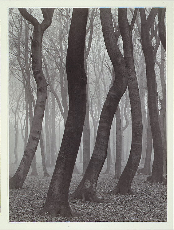
Vertical lines are far more active so they give a picture tension and a strong
sense of vertical direction - think of the towering trunks of coniferous trees
reaching for the sky.

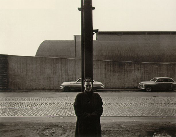
 Albert
Renger-Patzsch
Albert
Renger-Patzsch
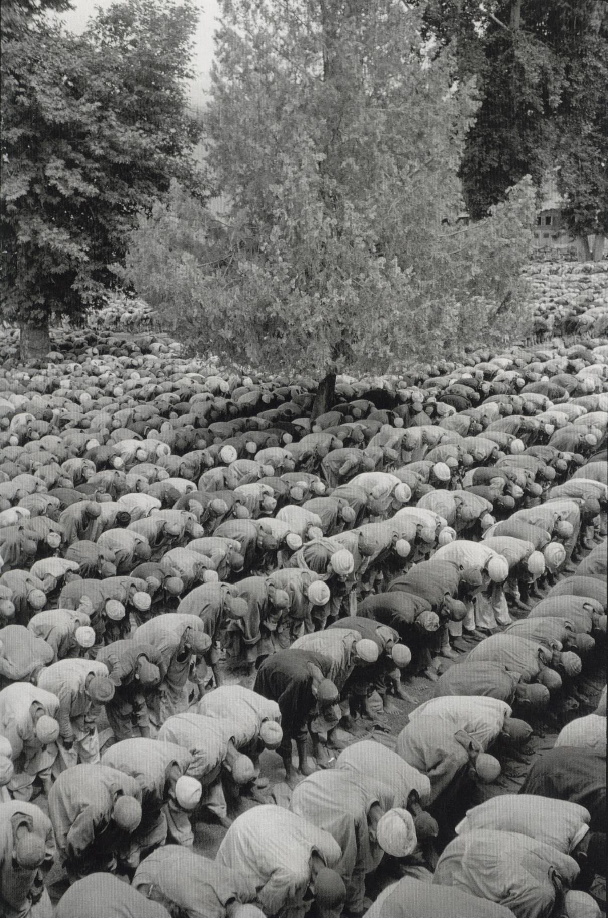
Geometry in composition
Geometrical elements are rarely very good as subjects, primary or secondary. Instead, they serve an auxiliary role, helping pull the picture together. They have at least three common and very important uses:
1. The leading line
A leading line does what it says: it leads the eye from one part of the picture to another: from the foreground to the background, the secondary subject to the main subject (but very rarely the other way round). The leading line adds motion to an otherwise static picture and ties different elements in it together. Diagonals and arcs or other unclosed curves make good leading lines.
2. The spatial divider
A spatial divider divides the picture into discrete areas, which work together to make the composition. Not all pictures are based on areas, but sometimes areas can make for a strong composition even in the absence of clear points of interest.
![]()

![]()
![]()
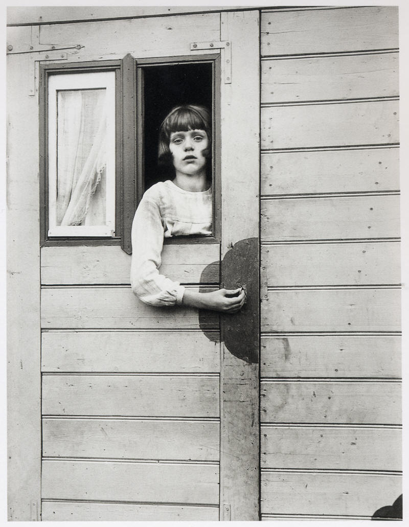
3. The framing element
A framing element serves to focus attention on the main subject. It usually covers at least two edges of the picture and can intrude a good way into it, sometimes taking up most of the space in it. For this to work, the framing element has to have some interesting characteristics of its own: color, texture, or shape. Bold, geometric shapes can work very well as framing elements: triangles or arcs work especially well. Usually, framing elements should be lower-key and more muted than the main subject: they are not meant to distract, but to focus, even when the actual point of the picture is the framing element, such as with some of the Phony Subject examples.
 Garry Winogrand
Untitled 1954
Garry Winogrand
Untitled 1954

 Sherman Hines, Harry
Callahan, August Sander
Sherman Hines, Harry
Callahan, August Sander
What does it mean?
Geometrical elements are simple, recognizable forms, such as squares, circles, triangles, lines, and curves. Compositionally some geometrical forms have more possibilities than others: squares and circles, for example, are more static and therefore less interesting than triangles or open curves.
Some geometrical shapes have especially great compositional potential:
We're going to focus on these shapes and their uses.
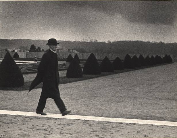
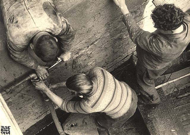
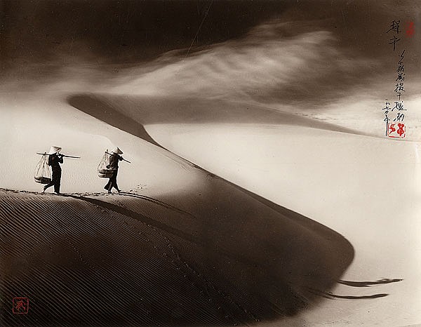
The diagonal
Perhaps the most striking compositional device, the diagonal principle, was first employed by the Japanese print masters, Katsushika Hokusai and Ando Hiroshige. European artists were dumbfounded by the unconventional kind of depth created by the natural direction of eyes into the distance. In Sudden Rain in Shono by Ando Hiroshige, in which in addition to the diagonal line from bottom right to top left, he elaborates the picture by depicting the rain counter-diagonally, turning the treetops to the left, thereby adding a dramatic effect.
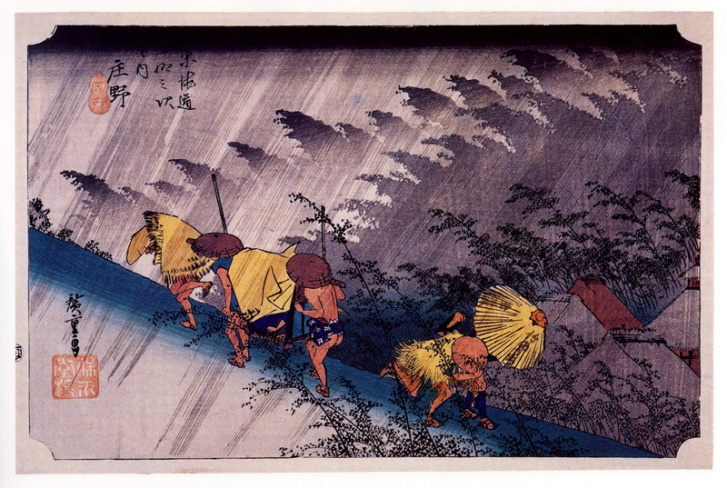 Sudden Rain In Shone Ando Hiroshige 1893
The most similar Western counterpart would be Funeral under Umbrellas by Henri Riviere, in which he enhances the sense of depth by synthesizing the diagonal principle and the Western perspective expressed in a taller frame. Not only did he incorporated the diagonal composition, he also borrowed the theme, which had not been considered authentic until that time.
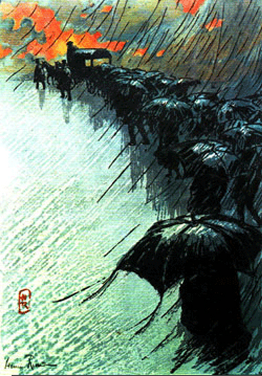 Funeral under Umbrellas Henri Riviere 1895
Since the diagonal device furnishes a dramatic touch to the picture, it is most effective when employed in such themes as unusual natural phenomena as in the examples shown.
 Don Hong-Oai
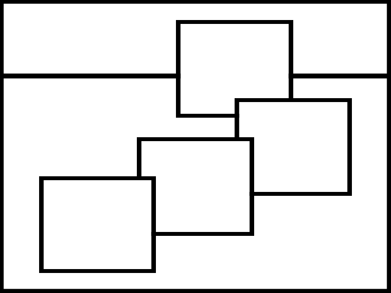
A picture with a diagonal element is almost always more dynamic and stronger than the same picture without it. While verticals and horizontals usually divide the space into areas, diagonals connect. Indeed, one of the most common and effective uses for the diagonal is the *leading line* -- something that connects a main subject to a secondary subject, causing the eye to move inside the frame. In this role, diagonals can be strong components of perspective and depth, giving a picture three-dimensionality.
Here is a picture composed around diagonals used as leading lines and to
create three-dimensionality:


![]()
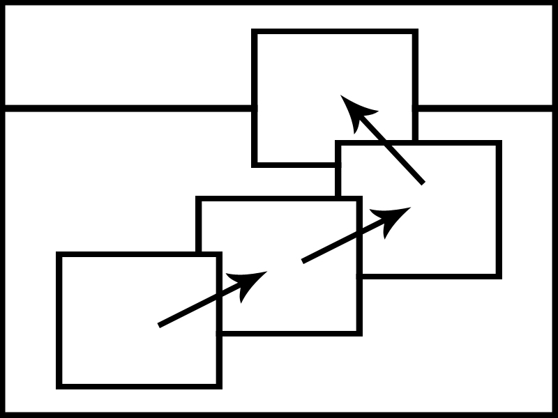
Here are pictures composed around a diagonal used as a leading line and a space-divider, but not primarily an indicator of perspective:
The simple diagonal is one of the most versatile geometric entities usable in compositions. Look for them, and make the best of them. However, since the diagonal is a line and often both enters and exits the picture, it's important to put something on it to stop the eye from running out of the frame. Using it as a leading line, from the main subject to the secondary one or the foreground to the background, for example, is a good way to arrange this.
A triangle is a closed curve that incorporates at least one diagonal. Being closed, it won't lead the eye out of the frame. However, especially an equilateral triangle is a lot more static than a diagonal. By itself, and especially in the middle of the frame, it can lead to a static and boring composition. Sometimes triangular areas can make for unusual pictures, like this one, for example:

The arc can be a wonderful compositional element. Unclosed, it can serve as a
leading line, pulling the eye towards the main subject, a spatial divider, or a framing element, focusing the attention on the main subject:

 sgrais
 Abelardo Morell
Especially if it's asymmetric, it can force a dynamic and interesting
composition.
If you see an arc, study the scene carefully and find elements to balance out the (usually) asymmetric composition created by the arc, and try to find a way to make best use of the arc -- don't just include it, concentrate on it and its purpose in the composition: is it a leading line, a connector, a spatial divider, or a framing element?
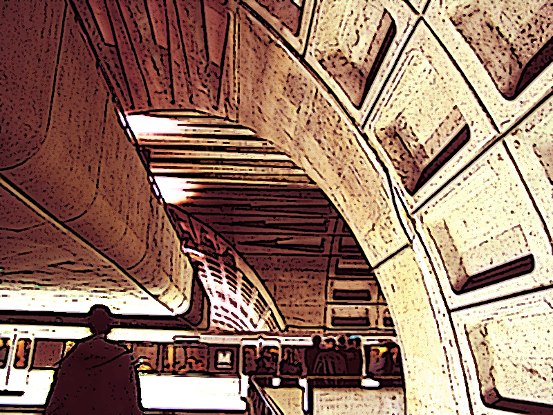
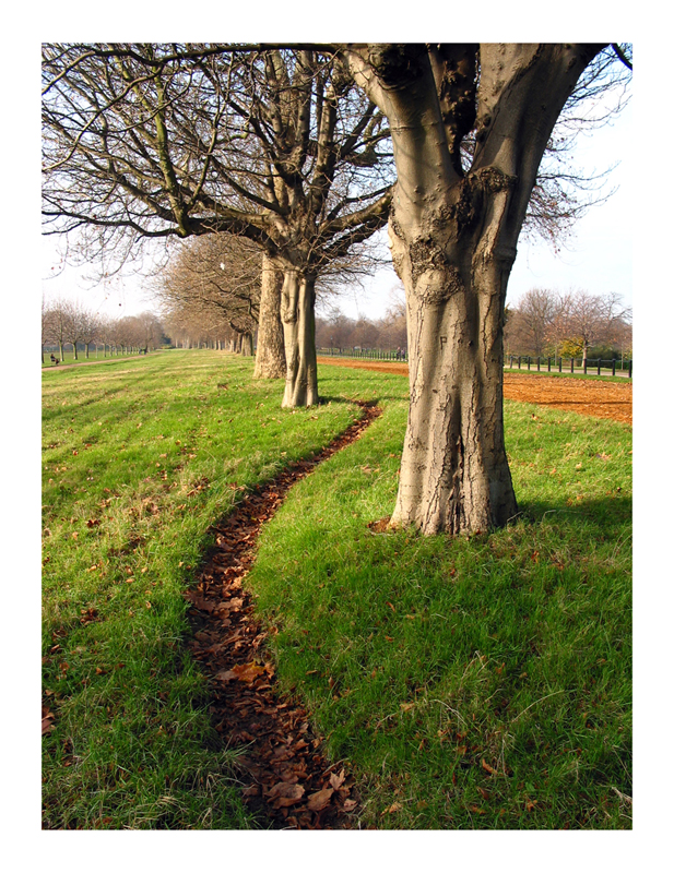
The s-curve
The S-curve is, well, a curve shaped like an S. It is compositional gold. If you see one, you *know* that there's a good picture to be had. The S curve is just about the only geometrical shape that can stand alone as a main subject, but it can also be used as a leading line, framing element, or just about anything else.
 sgrais

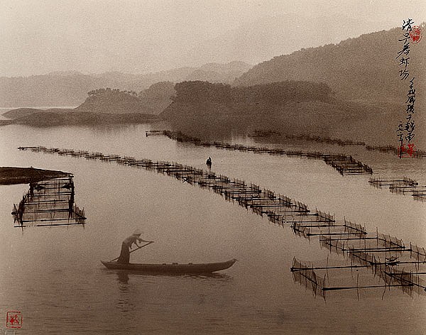
 Don Hong-Oai
The Key
The idea
is to become familiar with the principles above as a guide in training your eyes
to naturally create interesting and powerful compositions. In so doing, work to
simplify, reducing all elements in the painting to only the information you need
to express your subject or idea. In time, the very deliberate process of
developing a composition will give way to a more natural, intuitive,
interesting, and automatic activity, resulting in more original arrangements.
You will also be better able to control your visual statement by expressing what
you wish.