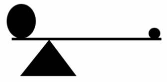
Balance
Is the ability to arrange all the elements so that no one part is overpowering.
If two objects weigh the same then the two sides of a scale will be balanced. If they do not then one side will tip.
In a composition balance is seen or felt by the viewer.
Balance is the visual weight or equilibrium of the objects within a composition.
Balance is instinctive and determined by imagining a center axis running through the picture plane with the expectation that there will be some equal distribution of visual weight on either side.
Perfectly balanced pictures tend to be boring, so it is usually helpful to have a certain degree of imbalance to generate visual tension and movement within a composition. Some key categories of balance to consider are:
Balance implies that the visual elements within the frame have a sense of weight. Large objects generally weigh more than small objects and dark objects weigh more than light colored objects.
Portions of a composition can be described as taking on a measurable weight or dominance, and can then be arranged in such a way that they appear to be either in or out of balance, or to have one kind of balance or another.
Balance ensures
that the two halves of a 2-D composition carry the same weight.
The position of the elements is also critical. We unconsciously assume the center of a picture corresponds to a fulcrum. A heavy weight on one side can be balanced by a lighter weight on the other side if the lighter weight is located at a greater distance from the fulcrum.

Unlike physical balance, visual balance can be
created through absence as well as presence.
The Dewing painting is interesting and attracts attention for this unexpected
quality.
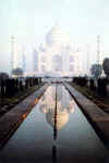
• Symmetrical balance: If you were to draw a line through the center of this type of composition, both sides will be an equal mirror image. Symmetrical balance tends to be calm, dignified, and stable.
Reflections of the landscape in still water are an example of almost perfect symmetry.

Reflections can take on an abstract quality that resembles a Rorschach inkblot used in a psychological testing.


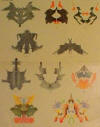
Rorschach Test
http://www.stupidstuff.org/main/rorschach.htm
Symmetry balances
a composition by systematically repeating patterns of form within a composition.
The most common symmetry in art is mirror (bilateral) symmetry, perhaps because it is the symmetry of the human body.
In this symmetry,
one half of a composition is repeated by its reflection in the other half.
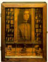
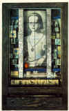 Joseph
Cornell Untitled (Medici Boy) 1942-52 and Untitled (Medici Princess)
c. 1948
Two-dimensional mirror symmetry is reflected across a line of symmetry, while three-dimensional mirror symmetry reflects across a plane of symmetry, any plane that divides an object into two mirrored halves is termed a plane of symmetry.
Asymmetrical (Informal) Balance

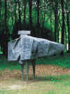 Lynn
Chadwick Stranger III, 1959 (cast 1996)
• Asymmetrical balance: A composition that has equal visual weights, but whose forms are disposed unevenly. For instance, a smaller shape positioned near the composition’s outer edge may balance a large shape near the center of a composition. Asymmetrical balance is active, dynamic, and exciting.
Asymmetrical balance can occur when several smaller items on one side are balanced by a large item on the other side, or smaller items are placed further away from the center of the screen than larger items. One darker item may need to be balanced by several lighter items.
Although asymmetrical balance may appear more casual and less planned, it is usually harder to use because the artist must plan the layout very carefully to ensure that it is still balanced. An unbalanced page or screen creates a feeling of tension, as if the page or screen might tip, or things might slide off the side, just as the unbalanced balance beam would tip to one side
Color
• Balance through color and value: The weight of a color can become the focal point in a picture. Warm colors (red, magenta, yellow) tend to advance and/or have more visual weight than cool colors (blue, green, cyan). The majority of a landscape is composed of cool colors.
![gauguin95[1].jpg (164500 bytes)](images/Balance/gauguin951_small.jpg) Paul Gauguin Femmes de Tahiti OR Sur la
plage (Tahitian Women OR On the Beach)1891
Paul Gauguin Femmes de Tahiti OR Sur la
plage (Tahitian Women OR On the Beach)1891
 Paul Klee Ancient Sound,
Abstract on Black 1925
Shape
Large flat areas without much detail can be balanced by smaller irregularly shaped objects since the eye is led towards the more intricate shape.
The front dancer in this painting by Degas stands out in intricate detail compared to the large blurry area behind her.Position
Using a balance beam, a larger weight closer to the center point can be balanced by a lighter weight further away from the center. This is the basis for balance by position. Sometimes larger elements on one side of the page can be balanced by a smaller element that is positioned by itself at the far end of the other side of the page. This is a very tricky type of asymmetrical balance that often ends up looking out of balance. Look at how the small watering can on the left is used to balance the larger dancers to the right
 Edgar Degas Dancers Practicing at the Barre
1876-77
Eye direction
Your eye can be led to a certain point in a picture depending on how the elements are arranged. If the people in a picture are looking in a certain direction, your eye will be led there as well.Elements in a picture, such as triangles or arrows, will also lead your eye to look to a certain point and maintain the balance of a picture.
Look how the eye direction of the dancers and musicians in this painting by Seurat moves your eye to the small gaslights which provide a focal point in this painting.
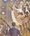 Georges Seurat,
Le chahut 1889-90
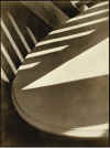 Paul
Strand, Abstraction, Twin Lakes, Connecticut, 1916
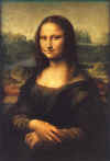 Leonardo Da Vinci La
Joconde 1503-06
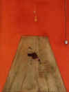 Francis
Bacon Blood on the Floor 1986
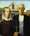 Grant Wood American Gothic
1930
A balanced diet or food for thought
1.
A large form is visually heavier than a smaller form
2.
A dark-value form is visually heavier than a light form of the same size
3.
A textured form is visually heavier than a smooth form of the same size
4.
A form placed close to the central axis may be visually heavier than a similar
form placed near the outer edge of the composition
5.
Two or more small forms can balance a larger one
6. A smaller dark form can balance a larger light one?
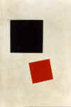 Kasimir Malevich, Black
Square and Red Square 1915 and Black Circle 1913