To Documents
Linear Correlation
Introduction
- The news is filled with examples of correlations and associations:
- Drinking a glass of red wine per day may decrease your chances of a heart attack.
- Taking one aspirin per day may decrease your chances of stroke or of a heart attack.
- Eating lots of certain kinds of fish may improve your health and make you smarter.
- Driving slower reduces your chances of getting killed in a trafficaccident.
- Taller people tend to weigh more.
- Pregnant women that smoke tend to have low birthweight babies.
- Animals with large brains tend to be more intelligent.
- The more you study for an exam, the higher the score you are likely to receive.
- The correlation, denoted by r, measures the amount of linear
association between two variables.
- r is always between -1 and 1 inclusive.
- The R-squared value, denoted by R2,
is the square of the correlation. It measures the proportion of
variation in the dependent variable that can be attributed to
the independent variable.
- The R-squared value R2 is always between 0 and 1 inclusive.
-
Perfect positive linear association. The points are exactly
on the trend line.
Correlation r = 1; R-squared = 1.00
-
Large positive linear association. The points are close to the linear
trend line.
Correlation r = 0.9; R=squared = 0.81.
-
Small positive linear association. The points are far from the trend
line.
Correlation r = 0.45; R-squared = 0.2025.
-
No association. There is no association between the variables.
Correlation r = 0.0; R-squared = 0.0.
-
Small negative association.
Correlation r = -0.3. R-squared = 0.09.
-
Large negative association.
Correlation r = -0.95; R-squared = 0.9025
-
Perfect negative association.
Correlation r = -1. R-squared = 1.00.
- How high must a correlation be to be considered meaningful?
It depends on the discipline. Here are some rough guidelines:
| Discipline | r meaningful if |
R2 meaningful if |
| Physics | r < -0.95 or 0.95 < r |
0.9 < R2 |
| Chemistry | r < -0.9 or 0.9 < r |
0.8 < R2 |
| Biology | r < -0.7 or 0.7 < r |
0.5 < R2 |
| Social Sciences | r < -0.5 or 0.5 < r |
0.25 < R2 |
Calculating the Correlation
- To calculate the correlation, first standardize both the x and y
variables:
zxi =
(xi - x) / SDx
zyi =
(yi - y) / SDy
- Then compute r = the average of the products
zxi
zyi
- Example: Compute the correlation r of this dataset:
- We calculate:
x = (1 + 3 + 4 + 5 + 7) / 5 = 4
y = (5 + 9 + 7 + 1 + 13) / 5 = 7
SDx2 =
[(1-4)2 + (3-4)2 +
(4-4)2 + (5-4)2 +
(7-4)2] / 5 = 4
SDx = √4 = 2
SDy2 =
[(5-7)2 + (9-7)2 +
(7-7)2 + (1-7)2 +
(13-7)2] / 5 = 16
SDy = √16 = 4
- Now compute the average of the z-scores of the x- and y-variables:
| x | y | zx |
zy |
zxzy |
| 1 | 5 | -1.5 | -0.5 | 0.75 |
| 3 | 9 | -0.5 | 0.5 | -0.25 |
| 4 | 7 | 0.0 | 0.0 | 0.00 |
| 5 | 1 | 0.5 | -1.5 | -0.75 |
| 7 | 13 | 1.5 | 1.5 | 2.25 |
| Ave. of zxzy: 0.40 |
- Thus the correlation r is 0.4.
- Remember: the correlation is always between -1 and 1, inclusive.
- Why does this work? Here are three possibilities:

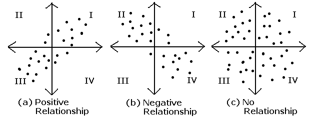
- In diagram (a), the x- and y-variables have a positive relationship.
Most of the (x,y) points lie in quadrants I and III where the
zxzy product is positive.
Therefore r > 0.
- In diagram (b), the x- and y-variables have a negative relationship.
Most of the (x,y) points lie in quadrants II and IV where the
zxzy product is negative.
Thereform r < 0.
- In diagram (c), the x- and y-variables have no relationship.
The positive products in quadrants I and III cancel out the
negative products in quadrants II and VI so the average of the
products is close to 0; r is also close to 0.
Calculating the Correlation with SD+
- Compute the correlation r of this dataset:
- Use SPSS to calculate descriptive statistics and z-scores:
x = 4.00
SDx+ = 2.236
x = 7.00
SDx+ = 4.472
| x | y | zx |
zy |
zxzy |
| 1 | 5 | -1.34164 | -0.44721 | 0.60 |
| 2 | 9 | -0.44721 | 0.44721 | -0.20 |
| 3 | 7 | 0.0 | 0.0 | 0.00 |
| 4 | 1 | 0.44721 | -1.34164 | -0.60 |
| 5 | 13 | 1.34164 | 1.34164 | 1.80 |
| Ave. of zxzy: 0.32 |
- Multiply by the correction factor n / (n - 1):
(ave of zxzy) *
n / (n-1) = 0.32 * 5 / (5-1) = 0.32 * 5 / 4 = 0.4.
This is the same answer obtained previously using SDx
and SDy.
Correlation with SPSS
- With the Laundry Dataset, use SPSS to display the scatterplot of price (y-axis) vs.
rating (x-axis):
- Import the Laundry Dataset dataset into SPSS.
- Verify that for the variables Rating and Price, Type is set to Numeric and Measure to Scale.
- Set the labels for Rating and Price to "Consumer Union Rating" and "Price (Cents) per Load", respectively.
- Select Graphs >> Chart Builder. In the Chart Builder Dialog, click CK
because you have already set the Measure of both variables to Scale.
In the
next Chart Builder Dialog, select Scatter/Dot, and drag the Simple Scatter from
the Gallery into the Chart Preview area.
Drag the Rating variable into the
X-axis box and the Price variable into the Y-axis box.
Click OK.
- In the Laundry Dataset, use SPSS to compute the correlation of rating and price.
- Select Analyze >> Correlate >> Bivariate...
Drag "Consumer Union Rating" and "Price (Cents) per Load" into the Variables box.
Click OK.
- The output shows that the correlation is 0.671
Cautions
- Caution: Correlation does not necessarily imply
causation.
- If X is correlated with Y, there could be five explanations:
- X causes Y
- Y causes X
- X causes Y and Y causes X
- Some third variable Z causes X and Y
- The correlation is a coincidence; there is no causal relationship between X and Y.
- Here are some examples of correlations with implied causations that
have various explanations:
- The more firemen that are fighting a fire, the bigger the fire
is going to be.
The actual causation is Y → X: The
bigger the fire is, the more firemen are necessary to fight it.
- For a gas, an increase in pressure causes an increase in temperature.
This is Charles' Law for an ideal gas. In fact X → Y and
Y → X. The causation works in both directions: an increase in
either temperature or pressure causes an increase in the other.
- Children that sleep with the light on are likely to develop
nearsightedness later in life.
This result was published in a study in May 13, 1999, in the Journal
Nature. In fact a follow up study showed that Z → X and Z → Y. There is
a strong link between parental nearsightedness and
child nearsightedness. Also, nearsighted parents were more likely to
leave the light on in a child's room.
- Women that take hormone replacement therapy (HRT) are less likely
to have coronary heart disease.
At first glance X → Y, but after controlling for the third variable
socio-economic group, the opposite effect was found: women that take HRT
were more likely to develop heart disease.
- As ice cream sales increase, the rate of drowning deaths increase.
This is also a case of Z → X and Z → Y. Both events depend on
the season of the year. In the summer months, ice cream sales increase;
drowning deaths also increase because more people to swimming.
- Piracy causes global warming.
It is true that both piracy and global warming have increased over the
past several decades, but this is just a coincidence. There is no
causal relationship. Another explanation is that both result from a common
third factor: population increase.
- For a correlation between X and Y to imply causation,
- X must precede Y in time,
- the causation must be plausable,
- common causes from other variables are controlled for.
- Question: Does smoking cause lung cancer?
- Caution: The correlation is misleading if there
is a nonlinear relationship between the variables.
Example 1:
There is a perfect quadratic relationship between
x and y, but the correlation is -0.368. A quadratic relationship between
x and y means that there is an equation y = ax2 + bx + c that
allows us to compute y from x. a, b, and c must be determined from the
dataset.
- Caution: Outliers can distort the correlation:
Example 2:
Without the outlier, the correlation is 1;
with the outlier the correlation is 0.514.
Example 3:
Without the outlier, the correlation is 1;
with the outlier the correlation is 0.522.
- Use SPSS to do continue the above analysis of
datasets/bears-1985.xls.
- Compute the correlation between meter and kilo.
- Create a scatterplot with a linear regression line
(linear trend line) of meter (x-variable) and kilo (y-variable).
- Repeat steps 1 and 2 after omitting the point that represents
William Perry.
