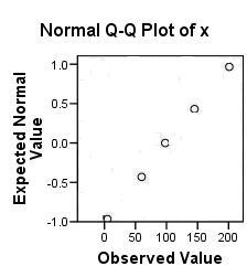
3 60 98 145 201
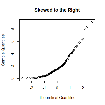
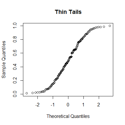
The dataset values on the y-axis are plotted against the normal scores
-0.97 -0.43 0.00 0.43 0.97.
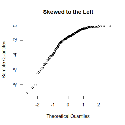
The dataset values on the y-axis are plotted against the normal scores
-0.97 -0.43 0.00 0.43 0.97.
# Suppose that the nbs-10.txt file is in c:/workspace.
setwd("c:/workspace")
df <- read.csv("nbs-10.txt")
w <- df$Thickness
qqnorm(w)
 |
 |
 |
 |
 |
 |
 |
 |
 |
 |