To Documents
Histograms
- Here are the directions for drawing a histogram:
- Divide an interval containing the data into equally
spaced intervals called bins. Except for the last interval,
each interval is closed on the left and open on the right.
Example: If the data is
5 39 75 79 85 90
91 93 93 98,
divide the interval [0,100] into the five bins
- [0,20) [20,40) [40,60) [60,80) [80,100).
- Prepare a table listing the number of observations
(frequency) in each bin:
Example:
| Bin | Frequency |
| [0,20) | 1 |
| [20,40) | 1 |
| [40,60) | 0 |
| [60,80) | 2 |
| [80,100) | 6 |
- Draw a histogram with one rectangle for each bin. The
base of each rectangle coincides with its bin. The area (not the height) of
each rectangle is the frequency of that bin.
- If the bases of all the rectangles are the same, the heights of the
rectangles are propostional to the areas, which simplifies things.
- Example: Here is the
histogram drawn from the table in
Step 3.
Bell-shaped Histograms
- Many histograms of real data are bell shaped.
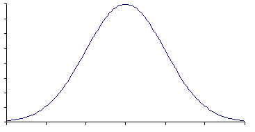
Here is a bell-shaped histogram with its bin boundaries erased:

- Notice that the bell-shaped curve is symmetric around
its center.
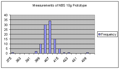
- If we disregard the two extreme outliers,
the histogram of the NBS-10 data is roughly bell-shaped.

- If a histogram is bell shaped, it can be parsimoniously described
by its center and spread.
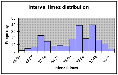
- Here is the histogram of some times between eruptions of the
Old Faithful Geyser in minutes:

- This histogram is not bell-shaped, so the center and spread are
not a good summary of the data.
