Split Toning Effect
Split-Toning:
Background and Historical Antecedents
from the December 2000/January 2001 Issue of
Camera Arts
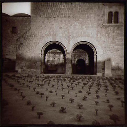
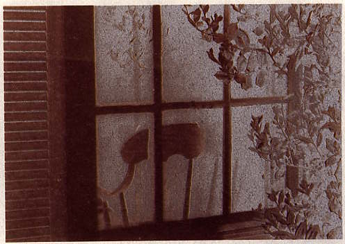
Oaxaca, Mexico, 1999; Jonathan Bailey; split-toned "Diana" photograph
http://www.jonathan-bailey.com/
I confess I’ve rarely been completely satisfied with “straight” black and white (gelatin silver) photography.
Over the past 25 years I’ve employed numerous devices to extend the dialogue with my images: I have gathered them into handmade books, collaged them, grouped them together onto mats, and even made paintings with them or based upon them. What I have endeavored to do is to make each step in the photographic process another beginning point – to use each result as a further point of departure. My most recent fascination – ongoing since the early ‘90’s – is with toning, most particularly split-toning.
To speak of split-toning in an authoritative way is, if not dangerous, at least problematic. Emmet Gowin – who was so helpful when I was first struggling with these processes – recently said to me that no one, chemist or otherwise, has ever explained to his satisfaction exactly what these split-processes entail. (see his interview and spit-toned images in Camera Arts, December/January ’98-’99). Gowin’s understanding of split toning has come mainly through direct experience. Indeed, much of what I will discuss here springs from my own direct and very subjective observation.
I’d like to suggest a simple definition: split-tones refer to both warm and cold tones simultaneously present in an image. Whereas conventional toning (sepia, for example) will render a print a uniform chocolate brown color, split-toning typically yields shades of reds and blues - occasionally even greens and violets - and therein lies the difference. The effects may range from subtle to extravagant. Generally speaking, split-tones are the result of chemical toners used after normal processing and fixing (more about this in the next issue).
Split-toning is a generic, somewhat mercurial term which is used to describe the deliberate attempt at tonal splits in the darkroom. However, split effects have been with photography from the very beginning and may well have formed an historical precedent for many modern practitioners of these processes. The issue is therefore, perhaps, one of intent. The question might better be: when were these visual effects first specifically sought out and deliberately attempted? Certainly, among the first of the published efforts was Olivia Parker’s beautiful book, Signs of Life, in 1978 (now out of print and, sadly, difficult to find).
I was interested to learn in my conversation with Gowin that he first started experimenting with toners in the late 60’s while he was learning 19th century processes in school. I first began experimenting with split-toning in 1993-94 while stalling for time to experiment with 19th century processes such as albumen or platinum. I have a long and abiding interest in photographs from the 19th century and I was hoping to bring to my own work some of the soulfulness and richness I associate with so many antique images.
What I’d come to appreciate with the antique images was how intimately intertwined image and process can become – that sense of inevitability when an image is coupled successfully with the “right” process. I was in search of something for my images which they seemed to be asking for - something I thought I understood - but I was delivered to something that took some time to fully appreciate. However, I had no idea how profoundly satisfying working with these old and esoteric processes would become.
Photographic images have historically demonstrated a range of subtle to exotic coloration. Daguerreotypes, for example, readily “split” in an area of intense exposure. While the effect is not, strictly speaking, chemically induced (it’s actually solarization), dags often exhibit a strikingly beautiful deep blue tonal split that almost seems to jump from the surface of the plate. This almost three-dimensionality I also associate with split-toning.
As photographic papers became commercially available a great many of them would tone with exotic results: among the more exotic were the bromide papers of the 1880’s and ‘90’s. These were the first of the gelatin-based factory-produced papers and they remained in scattered use through the 1930’ s. These images often possess a striking blue-red split that makes them easily identifiable. And too, commercially available printing out papers (POP), both vintage and modern, will often split when toned (witness Atget’s vintage work and Linda Connor’s contemporary work).
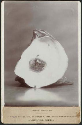
Maine Oyster and Pearl,
Bromide print 1895
(Collection of Richard and Christine Rydell)
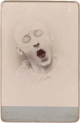
Fritz Young as "Pierrot,"
by R.C. Clifford, Bromide print circa 1895
(Collection of Richard and Christine Rydell)
Then there are the tonal splits that occur “naturally” as a result of inadequate fixing and/or washing and subsequent exposure to the atmosphere. Many older silver prints display an apparent splitting of their tones for exactly this reason - in effect, Gowin explains, a selective hypo-alum sepia toning of the print. He noted as many as one third of the prints in the recent Carleton Watkins exhibit at New York’s Metropolitan Museum showed signs of this effect.
Split effects can also be created from dual processing of hand coated papers: for instance, a layer of platinum under (or over) a layer of gum bichromate – a common practice at the turn of the last century, and a practice of which Steichen was a master. It’s interesting to note that some modern practitioners of 19th century processes have resurrected this habit today.
Photographs, in all their various forms, have nearly always been chemically toned as a way to heighten permanence – color changes were largely a collateral effect. Daguerreotypes hadn’t been around more than three or fours years before people realized that gold chloride and hypo, upon heating with a flame, would gild the silver on the plate and render a significantly more durable image. This archival benefit has been the major historical role for toners. It’s just that more recently (say the past 50 years), toning practices have been largely confined to archival enhancement - with any possible visual effects being systematically avoided. My fascination with toners is specifically about the visual effects that are possible.
It would seem a somewhat eccentric appreciation of the history of photography, or perhaps more accurately, the history of the photograph, might be required to fully appreciate the attractions of split-toning. I think it’s safe to suggest that all the photographers today who use some form of split-toning in their work (including Gowin, Thomas Joshua Cooper, Linda Conner, Lynn Davis, Linda Butler, Christopher James and Craig Stevens) seem intimately connected to photography’s past in some uniquely personal way. Each of these photographers seems to intuitively comprehend how the photographic process ultimately impacts the image’s emotional impact. I believe this aesthetic understanding flows directly out of a 19th century sensibility.
However, despite the serious work being done with these split-processes there remains resistance and misunderstanding about the effects. Some of this resistance lies in photography’s history: For most of the 20th century (especially the second half), photography in the United States has felt an obligation to be straight, truthful, and unaffected. Strand, Weston and Adams (to name only the most influential) vilified pictorialism, abhorring any mark of hand or “artful” device – and we still labor heavily under their prejudices today. Photography today is still very much linked to its content. Judy Seigel, in her superb World Journal of Post-Factory Photography, puts it thus: “…painting was declared its own event, while photography was declared a faithful copy of another, real event.”
Of course the issue of verisimilitude has haunted photography since its first days - people just want to believe a photograph. But as Frederick Sommer pointed out, there is an enormous difference between “a thing seen” and a photograph of “a thing seen.” He acknowledged the photograph is reality – but noted it is a photographic one. He further suggested a photograph is a thing seen in its own right.
Small wonder split-toning remains on the fringes of understanding and acceptance in mainstream photographic circles. Perhaps part of the attraction lies in at least a partial disengagement from the content of the photograph: an appreciation of the transformation that’s possible when we take a photograph out of the realm of document and into the realm of image. I have again and again found this transformation most easily apprehended with antique images: with these images we are frequently left knowing nothing of the photographers nor of the circumstances in which they worked – which leaves us to contemplate the unencumbered evidence of the photograph itself….
Fortezo Polywarm Paper split-toned with Nelson's Gold Toner
Fortezo
Polywarm Paper toned first in selenium toner, washed,
and then toned in Nelson's Gold Toner
Fortezo
Polywarm Plus Paper split-toned
using the GP-1 Gold process described in the article.
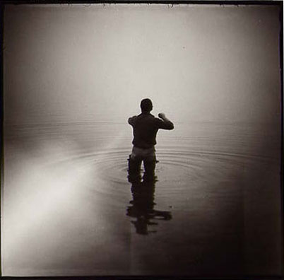
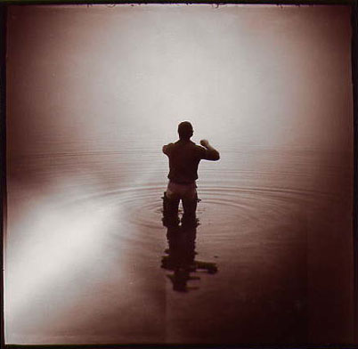
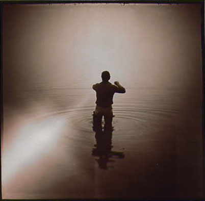
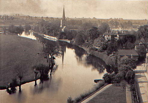
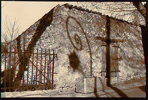
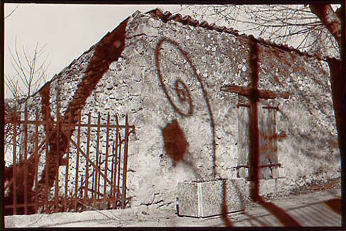
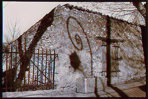
Photograph by Jonathan Bailey. Rangeley Lake, Maine. The image was created with a $2 "Diana" camera (with light leak). The left photo is the original, untoned print. The middle photograph illustrates the appearance after selenium toning, showing initial splits of plum-red and blue-green. The right photograph shows its appearance after treatment in Gold (GP-1) Toner. Note the rouge in transition between light blue and darker green.
http://unblinkingeye.com/Articles/SplitT/SplitT2/splitt2.html
http://www.jonathan-bailey.com/
http://www.doubleexposure.com/photoshop.shtml
Split Toning Photoshop Tutorial
http://tutorialpulse.com/43/breathtaking-split-toning-effect/
As usual, begin by opening a photo into Photoshop. If this is your first time following this tutorial, use a close up portrait photo. This split toning Photoshop effect works well with portraits but not very well with landscapes
.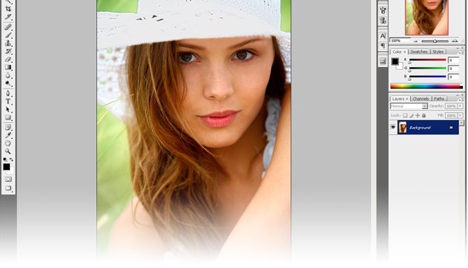
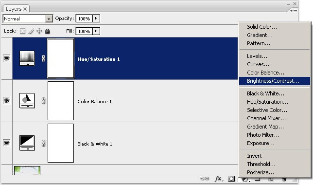
First, if you didn’t open a black and white photo, you need to convert the image to black and white. There are many ways of doing this but the easiest method with Photoshop CS3 is to add a Black & White adjustment layer. If you’re using an older version of Photoshop, you can also use:
In the layers palette, click on the new adjustment layer button and select the method you want to use to convert your photo to black and white.
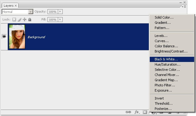
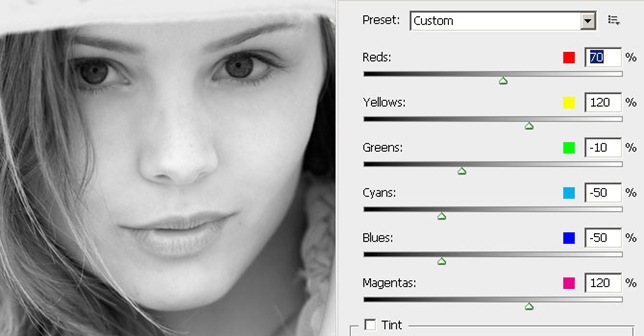
I’m using Photoshop CS3 so I chose to use the Black & White tool to make my color photo black and white. Here, I adjusted the settings to create the best tonal information. There isn’t one setting that will work with every photo - you’ll have to adjust the settings yourself.
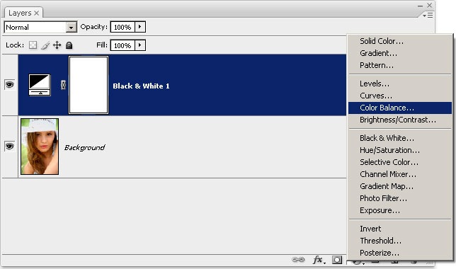
Now that our images are black and white, we’ll add a color balance adjustment layer. This adjustment layer is the key layer that will create the split toning effect. Go ahead and add a color balance adjustment layer.
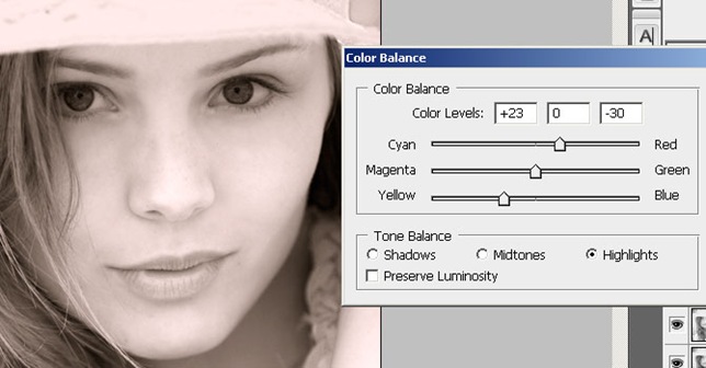
Inside the color balance tool, you can see that you can modify the shadows, midtones, and highlights. We will be working with only the shadows and highlights. What we’re going to do with this tool is alter the color balance of the shadows and highlights so that it creates a color tint.
First, toggle the highlight option and use the settings below. Your image should have a warm tint.
Now, select toggle the shadows and use the settings below. This will add a cool tint that will create a balance with the warm tint that we applied previously.
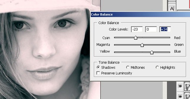
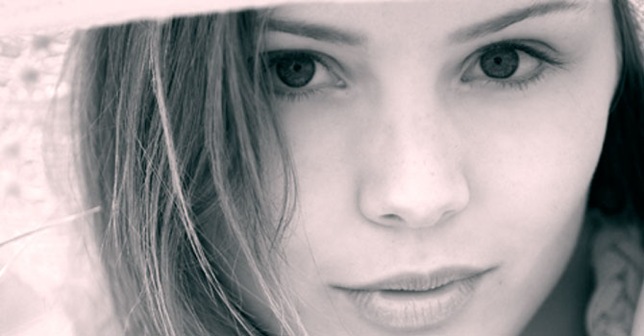
You can play around with the settings to achieve different color results but leave the settings alone if this is your first time following this Photoshop tutorial. Below is what the image looks like after applying the color balance adjustment layer. It has the split toning effect, but it might not be the colors that we want. In the next step, we’ll use the Hue/Saturation tool to modify the colors.
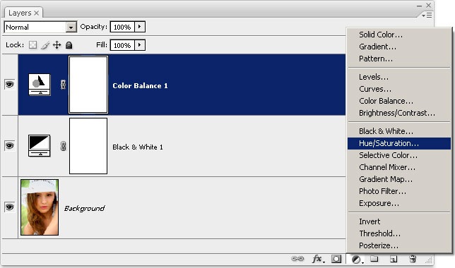
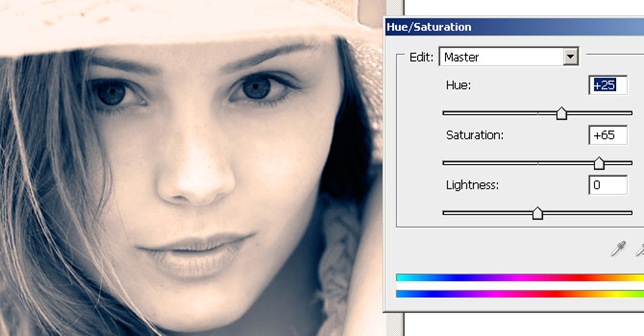
Add a Hue/Saturation adjustment layer. With this layer, we can alter the hue of both the colors and adjust the saturation.
In the Hue/Saturation tool, adjust the hue to get the color effect that you like. Below is the settings I used to create a warmer and slightly more vivid effect.
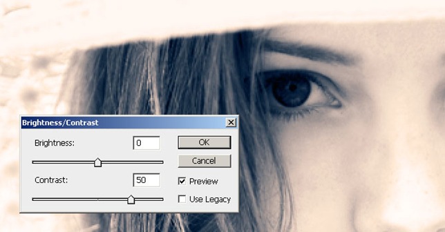
Finally, you can decide to add more contrast. This step is optional, but you will find that many times, the split toning effect will make your image look a little dull. You can add a brightness/contrast adjustment layer to enhance the contrast.
If you’re using Photoshop CS3, add a brightness/contrast adjustment layer. It has been greatly improved from the previous version of Photoshop. If you’re using Photoshop CS2 or older, add a levels adjustment layer instead.
With the brightness/contrast tool, you can simply adjust the contrast input slider to enhance the contrast. If you’re using the Levels tool, move the left and right input sliders towards the middle to increase the contrast.
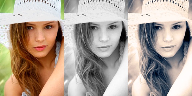
Here’s a comparison of the color image, black and white, and split toning. As you can see, the split toning is like a step between a color photo and a black and white photo. It is a beautiful effect for portraits and more and more photographers are using this.
Split toning is an effect that you can add to your
photographs to achieve different looks that range from subtle to over-the-top.
It is a classic darkroom technique with a long history that takes years of
trial-and-error to master. Luckily for us, instant gratification in the way of
real-time updating sliders is afforded to us by the new Adobe Photoshop
Lightroom and Adobe Photoshop CS3's Camera RAW 4 (ACR).
As with many of the new RAW conversion capabilities, both programs share the
exact same functionality in the case of split toning. In Lightroom you'll find
the options inside the Develop Module while ACR 4 has it's options in the
(tragically nondescript) tab called "S".
The concept behind a split tone is a relatively simple one: tint the highlight
pixels with one shade and the shadow values with a different shade. Ah, but
which
shades you ask? That's the magic of the sliders: you get to try on as
many different variations as you'd like before you are committed to any
particular mix. While typically applied to grayscale images, split toning can
also be used to good effect on certain color images - especially those which by
their nature border on a monochromatic tone set.