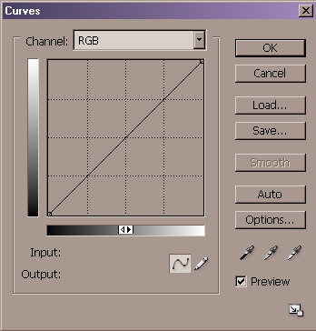
Curves

Curves allow pinpoint control over the entire color spectrum of the image, letting you be as general or specific as you want to be. It also demands the most color knowledge from you, asking that you at least have a basic understanding of numeric color values and channel separations.
Curves let you modify the entire image, or just one of the color channels, changing the highlights, mid-tones, or shadows in the image. It's also a great place to set white point and black point changes for quick color cast corrections.
The default Curves dialog box is a simple 4x4 box grid with a diagonal line from bottom left to upper right.
To achieve an even more detailed, 10x10, control box Option key – click (MAC) or Alt key – click (PC) in the grid box.
If your Curves dialog does not have as many grid increments as those shown below: option/alt click in the grid area. This does not affect the functionality of the curves in any way, but does help in visualizing the tonal steps.
Those
more familiar with the photographic film curve and Ansel Adams’ Zone System will
prefer the 10-zone grid, as this is a close approximation of the system. Either
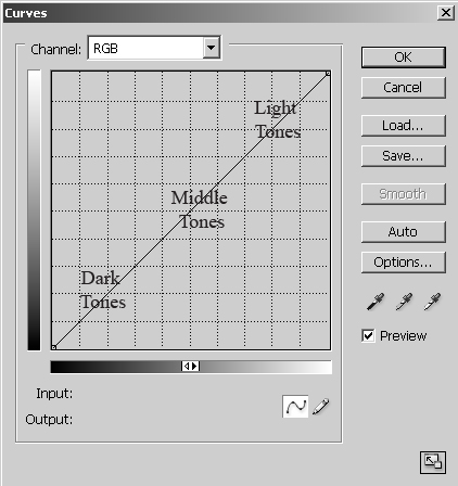
way, black is at the bottom left as level 0 (zone 0), the center intersection is
level 128 mid-gray (zone V) and the top right is white at level 255 (zone X).
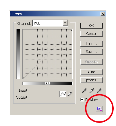
Click the box in the lower right to enlarge.....
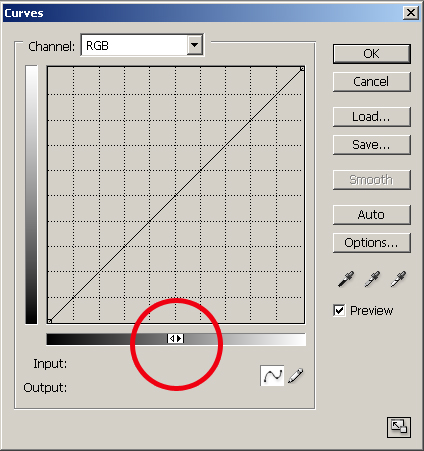
Also note the two triangles in the middle of the bottom gray scale. The convention in RGB is to display black at the left and white at the right. Oddly, the convention for CMYK is exactly the opposite! To avoid confusion, I recommend you set yours to the way I have it - the example curves will make much more sense.
The idea behind Curves is all about re–mapping brightness values. A pixel starts out at a certain brightness, and you change it to be brighter or darker.
I hope it’s clear that the Curves dialog opens as a straight line because you haven’t made any changes yet. That means that the brightness values before and after are the same. You will effect a change by changing the shape of the curve! You accomplish this by clicking once somewhere on the line. This will establish a “point”; this point can now be dragged to a different place within the grid, which causes that tonal value to change, either lighter or darker depending on whether you drag it up or down. The reason it’s a curve is so that the change blends smoothly throughout the image.
An abrupt change in value can be very noticeable. The increasingly gradual change of the brightness values on either side of the change permit a very smooth and believable adjustment.
These next illustrations demonstrate how a certain value is affected by a curve, and how you can start to visualize how the shape of the curve affects tonality. (These are pretty exaggerated curves for illustration purposes. Sometimes you need curves this strong, but for many images the curves will be much more gentle. A little bit goes a long way!)
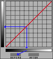
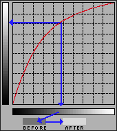
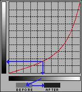
Now it’s finally time to apply this tool to an image. For the first part we will stick to a grayscale image. Color images introduce other issues and we’ll get to them soon enough. Shot with a digital camera on a hazy evening, it’s severely lacking in contrast — “snap”. It could happen to you! Can we improve it with curves? Let’s look at the previous curves and their effect.
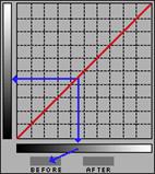

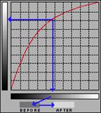

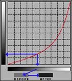
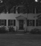
Neither the lighten or the darken curve is particularly effective at fixing all the problems, but you may have noticed that each of them had at least something going for it.
A curve can have just about as many points on it as you could practically ever need. We’ll see what happens with two points — boosting the light values and lowering the dark values, all in one curve:
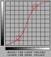

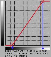
Actually, in an image such as this one with no black or white, the first thing I would do would be to force the range of tonal values to include the full scale. Did you know that the white and black end points in the grid can be moved too? If we keep the “curve” a straight line, but with a steeper slope, black and white come into the image and all the tones in between gain contrast. This trick alone is all lots of dull flat images need! The parallel to this technique is moving the black and white sliders in the Levels dialog to the beginnings and ends of the histogram (although as we will soon see, there are still some instances where there is an advantage to using Curves over Levels). (Micro Tip: to quickly invert an image, reverse the line: drag the black endpoint from the bottom left to the top left; drag the white endpoint from the top right to the bottom right.) Now you may be thinking not every image has a black or a white in it. True, but most do, and all your images will have more “pop” if the whole available dynamic range is utilized.

TIP ONE: Set Range With Eyedroppers
Let’s look at the right side of the dialog. “Preview” should always be checked so the image window reflects what you are doing. The “Auto” button should be used with caution; clicking the button will set the lightest value to white and the darkest value to black.
This can of course be a time saver, but giving up control to an automated function is seldom the best course of action (it’s even more dangerous with color images, where it assumes the lightest and darkest points should be neutral!). Often the lightest meaningful tone and the darkest meaningful tone can only be detemined by you, and in the context of the specific image! However, the eyedroppers can be a help. (Since we have a grayscale image here, the middle, “neutral” dropper is meaningless.) Click on the black (left) eyedropper and then, in the image window, click on the tone you want to move to black. Do the same thing with white. Fast and precise. If you have been given target values (as you might if preparing files for print), a double click on one of the eyedroppers calls up the color picker, and you can define what exact value the eyedropper will set the image tone to!
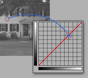
TIP TWO: Locate Values on the Curve
If you want to locate where on the curve a particular value in your image falls, move the curser into the image window. It turns into an eyedropper icon. Click and hold, and notice how a little marker shows up on the curve! Really helpful. Want to open up the subject’s face? Click and find out where on the curve that value lies. If that’s not good enough, it gets better! Hold down the command/control key while you click in the image, and Photoshop not only shows you where that tone lies, it automatically places a point on the curve for you! (Just make sure you don’t have one of the eyedropper tools active when you do this, or you’ll accidentally set a white or black or neutral point.)
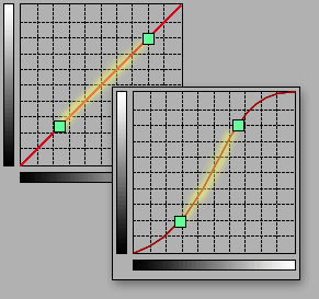
TIP THREE: Strengthen Local Contrast
The final tip for this section is related to tip 2 above. We have talked about maximizing the available tonal range for your image. Now we get a little more deliberate. We’re going to talk about maximizing the tonal range for the subject of your image! Many photographs have a subject and a background or a foreground. Think about a portrait for instance. In most cases, we care more about the subject than we do about the background, so the effort should be to get as much snap and sparkle into the subject as possible. We’ve seen how the contrast is increased where the slope of the curve is steeper. Click and hold in the image window and move the curser around the subject, and make a mental note of the approximate parts of the curve the marker slides around. Now you know how you can find where on the curve the majority of your subject lies! Steepen the slope of that part and you will gain a great deal. You have to try it to believe what this tool can do for average photos. What you gain in the subject will be to some extent at the expense of what is not the subject, but in many cases that’s a fair trade–off — it’s background!
Here’s a before and after example of what I’m talking about, with the real life curve below:
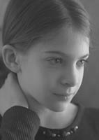
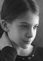
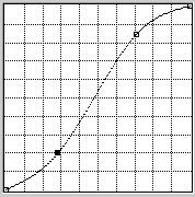
With experience you will begin to see tones in relation to their position on the curve, and you will become much more sure and decisive. It’s a good idea to do a rough “mental analysis” before invoking the Curves command so you start off with a general idea of what needs to be done. Once placed, the points remain moveable. And you will find that as you place a point and begin to adjust the curve, the image preview becomes a powerful feedback tool — your hand will adjust the position of the point and the slope of the curve together as one gesture. You are not committed to the change until you click “OK”, and you are certainly not limited to one or two points (though I try to keep it to as few points as possible - often times 2 is enough; regardless of what you read in Photoshop books, don’t fall into the trap of making things more complex than they need to be). It’s not unusual for me to stay in the Curves dialog for several minutes, making subtle changes, tweeks and fine tunings before saying “OK”.
A little thought will help you realize that there is no such thing as a curve apart from an image, and no such thing as a generic curve. Every image is unique, and so is every curve. Visualize how the optimum curves might differ for photos where the important information lies in the light tones (a polar bear on a glacier), versus one where the important area is in the dark tones (a black cat in a basement), versus one where the subject matter is predominately middle values (as in the portrait of Becky, above). Now you know how to approach different images: run your mouse around the image window; note where the range of values lie and steepen that part of the curve! Here are two more examples:
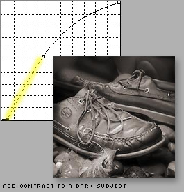
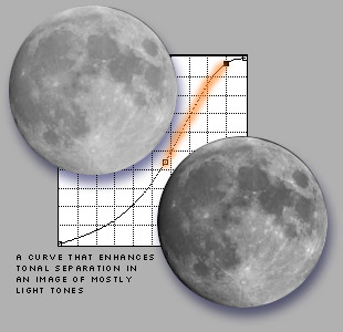
By now you may thinking I have spent a disproportionate amount of time and words on grayscale images. Since you probably think you work in color how could this apply to you? First, as I stated at the beginning of page 2, the concepts are simpler to present without the issue of color. And second - RGB color images can (and should be) thought of as being comprised of a composite channel and three essentially grayscale channels containing the brightness values of the three colors. If you have never thought of it this way, study this illustration:
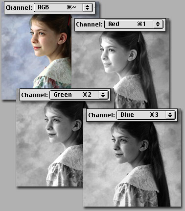
Are you getting an inkling of where this is headed? You can edit each channel with a curve just as we did a grayscale channel, but now in addition to affecting contrast we are affecting the amount of Red, Green and Blue, effectively manipulating color channel by channel. This is the most powerful and precise color correction tool in Photoshop. From this moment on in your career, skip the Color Balance command all together, and save Hue/Saturation and Variations for special effects work. We have something better!
When you invoke the Curves command in an RGB image, the channel displayed at the top of the dialog box defaults to the composite channel: RGB. If your image is okay for color but just needs to be lighter or darker or contrastier, a quick pull of the composite curve will do it, just as with grayscale images. Things get a little more complicated if the color itself needs to be modified. How do you start? Where do you begin? You begin by evaluating the image for a color cast and eliminating it. One of the first big mistakes many people make is to start haphazardly attacking what they percieve to be a color cast in a part of an image with selection tools; in reality, if you can see a color cast in a part of an image, chances are good it has infected the entire image, and should be addressed globally before local tools are brought out. How do you determine if there is a color cast, and what color it is?
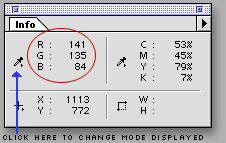 Let
me introduce you to our second most helpful tool, the Info Palette. Windows>Info
brings this little puppy up, and it should be given a permanent place of honor
on your desktop. Run the cursor around your image (doesn’t matter which tool you
have selected) and notice that the info palette displays the RGB values for
whatever pixel lies under the cursor! Color correction “by the numbers” is the
ultimate hallmark of the master color technician, and is way
beyond the scope of this introductory piece. But just knowing one fact will make
an enormous difference in how you approach color correcting: for a pixel to be
neutral, just remember that the values for Red, Green
and Blue should be the same. It doesn’t matter what they are, just that
they are the same. A light gray will have different values from a dark gray, but
if R=G=B you know they will be neutral. (As a sidebar: our eyes and brain are
tremendously adaptable; they work together to pull things almost neutral, or
almost black, or almost white to what the brain thinks they should be. Colors
are okay to evaluate from the monitor, but black, white and especially neutrals
should be confirmed with the info palette.)
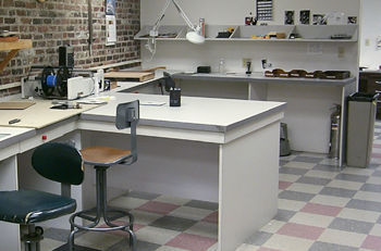
I can’t tell you what color skin should be, or what values to use for green grass or a navy blue suit. But neutrals are your point of reference. Of course not every image has a neutral in it, but if you start looking, it’s amazing how many photos have something in them that can be used as a neutral reference point. A white shirt; a car tire; a paper on a desk; asphalt paving; a white fence; granite foundations… you get my point. If you need a neutral, chances are better than 50/50 you’ll find something. Now, what can you gather about the color of the pixel being described by the info palette in the previous paragraph? It sure isn’t a neutral! The value of Blue is much lower than Red or Green. What's the opposite of Blue? That’s one pretty yellow pixel. If that was supposed to be neutral, we’ve got to bring blue into line with the others.
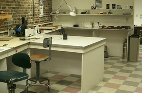 In
fact, that reading came from this image, shot with a digital camera in a
flourescent lit room. You might look at it and have the distinct impression of
“something’s wrong”, but what? We tend to think of flourescent lighting as being
deficient in red, leading to green images, but in this case the combination of
light and camera is less green than it is yellow. How do we know that? Well,
I’ve done you a favor by picking an image with loads of potential neutral
reference points. (You can grab a larger version of this image
here if you wish to work with it on your own.) We run the cursor around any
one of the things that our eyes say probably ought to be neutral, and over and
over again the Info Palette announces that blue is seriously low.
Here’s the reference point I chose, and the Info display, followed by the correction applied, followed by the net result:
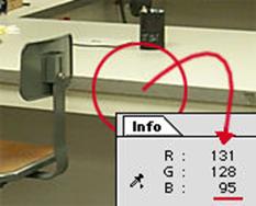
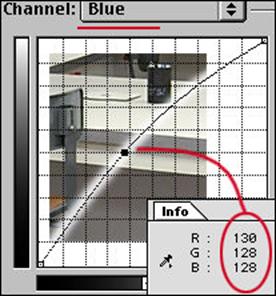
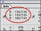 Locate
the source of the problem with the Info Palette. Go straight to the problem
channel in the Curves dialog. Make the problem go away. As you move the curser
out of the image window into the Curves dialog, the Info paletted display goes
away; but if you have made a change to one or more curves, when the cursor goes
back into the image window the read–out now displays a “before and after”
reading. Wow! And, as we saw in grayscale, a command/control click in the image
window plants a point on the curve. In color it gets better: if you have, for
instance, the blue channel displayed, that's where the point gets planted. Wow
Wow! Simple! Of course not all images are this simple, and even
this one could have used other help too, but the point is just look at what a
difference pulling one point in one channel
made! I could have spent ages having at it area by area, but pulling a global
curve based on a known neutral worked wonders. Are you shocked? Are you stunned?
Are you ready to go?
![]()
![]() Here’s
a super helpful tip Adobe introduced with Photoshop 5. It’s annoying to have to
keep making trips back into the image window to check on whether you've brought
the color value to where you want it. And it’s hard to get the curser back to
the exact same place each time. Hiding under the Eyedropper tool is a locking
eyedropper. Click in the image on the point you want as a reference; the little
cross hair icon stays there and a new level appears in the Info Palette.
Adjusting curves is simple now: the before and after readout is always there to
refer to until you dismiss or accept the changes.
Here’s
a super helpful tip Adobe introduced with Photoshop 5. It’s annoying to have to
keep making trips back into the image window to check on whether you've brought
the color value to where you want it. And it’s hard to get the curser back to
the exact same place each time. Hiding under the Eyedropper tool is a locking
eyedropper. Click in the image on the point you want as a reference; the little
cross hair icon stays there and a new level appears in the Info Palette.
Adjusting curves is simple now: the before and after readout is always there to
refer to until you dismiss or accept the changes.
 The
eyedroppers still work, just as they did in grayscale, and now the middle,
“neutral” dropper has some meaning. As we discussed before, double clicking on
each of the eyedropper icons will open the color picker. This allows you to set
exactly how that dropper will function. If you have some specific parameters,
this can be very useful. If you need to keep whites no lighter than 250 – 250 –
250 and blacks no darker than 5 – 5 – 5, set up the droppers and that’s what you
will get. I still prefer direct manipulation of the curves most times, but the
droppers can be handy. I still have same guarded opinion of the Auto button
however. A click on this will set the darkest point in each channel to 0 and the
lightest to 255. Sometimes it’s great, but often it does violence to both color
and contrast. However, if you are stumped by an image, give it a try. The
preview will tell you the story pretty quickly; if you hate it, try this trick:
hold down the option/alt key and notice that the button which had been “Cancel”
changes to “Reset”. Now wasn’t that thoughtful?
Two final points before concluding with some Power User tips. Point One: We have looked so far at doing everything globally (to the whole image at once). But you might see that there are times when it is in fact warranted to use curves on a local selection. There are times when the foreground doesn’t match the background, or the background is too dark but the subject is okay… any number of cases can come to mind. After having done everything possible to the image overall, it’s certainly legal to have at it with selection tools and work locally with Curves! They are just as powerful and capable inside a selection boundary.
Point Two: I have invested many many words describing how to discern and remove a color cast from an image, bringing it to neutral. But not all images want or need to be neutral! There will be times when you will want to enhance a tan, exaggerate a sunset or brighten up a lawn. There will be times when an image needs to be warmed or cooled to work better with other images in a montage. You should have no fear now! Your eyes will have to be your guide since this is interpretation and there are no numerical reference points, but if you had to put a little more red into a face or take some yellow out of moody twilight shot, you know how to approach it now. If at the same time you need to make it darker and less contrasty - one trip to Curves and you can take care of it all!
Adjustment layers permit unlimited lossless fiddling!
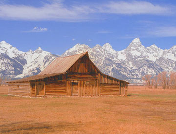 Fig.
2
Start by moving the crosshair
cursor to point A and clicking to establish an anchor/drag point. This point
will be used to adjust the quarter-tones or highlights. Then move to point B,
click and establish a mid-tone anchor/drag point. Finally move to point C and
establish a three-quarter-tone or shadow anchor/drag point. See Figure 1.
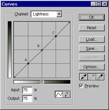 Fig. 1
Make sure you have the preview
box checked at this point so you can see the changes as you make them!
Adjusting the contrast can
now be done via three simple steps.
(1)
Pull the highlights down to the desired level.
Grab point A, the highlight
drag point by moving the cursor over it and clicking. Pull it down while
watching the highlights in your image. Clouds if available are good visual
reference points. Stop pulling when things are to your liking. Most midtones
and all the shadows should remain unchanged. Be careful not to burn out the
highlights by going too far. See figure 2.
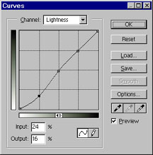
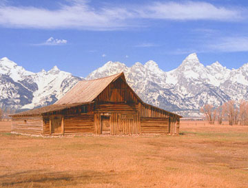 Fig.
2
(2)
Grab point C, the shadow drag
point by moving the cursor over it and clicking. Push it up while watching the
shadows in your image. Stop pushing when things have darkened to your liking.
See Figure 3. You can move the drag point slightly left or right for more
subtle tone changes.
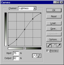
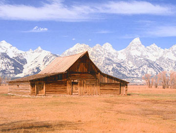 Fig.
3
(3)
Grab point B, the midtone
point and tweek the midtones up or down so the overall image tonality looks
good. Sometimes this might night not be needed, but the first two steps will
usually move things out of visual wack enough that some midtone adjustment is
necessary. See Figure 4.
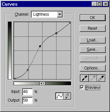
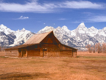 Fig.
4
The new tonality curve you've
just created to enhance your image is called the S-curve.
If an image is overly
contrasty rather than flat the process would be reversed and the S would appear
inverted.
Simply pulling down on all
three adjustment points would tend to lighten the overall image and is similar
to increasing brightness with the Levels command, but much more precise.
Likewise pushing up on all
three adjustment points would tend to darken the overall image and is similar to
decreasing brightness with the Levels command.
With plenty of practice, you will become better and better at placing the image tonality where you want it. Multi-contrast paper, RIP.