Photoshop Basic Color Controls
Adobe has created Photoshop with the basic idea that choice and variation in software design is a good thing. They don't give just one way to correct color; they deliver many different correction options. Why have options when you only need one? The idea is twofold. First of all, there are many different kinds of Photoshop users. Some are very technical, with a complex understanding of color theory, while others are just casual users. The strength and effectiveness of any program is in the way that it caters to the full spectrum of users, from remedial to expert. Photoshop shines in this regard, delivering as much or as little control as necessary to meet the needs of the user.
The second reason for so many controls is that the science of color involves a number of variables, which can be manipulated globally or within smaller subsets. Sometimes you just want to change one of these components with a more specialized tool rather than using a general-purpose tool for global corrections. For example, changing a slight color cast involves a different approach than tweaking the hue or saturation. In addition, making a global change in overall contrast would be very difficult if you had to change hue, saturation, or brightness independently. In short, each tool has its place, depending on the task at hand.
Most of the color controls in Photoshop are located in the Image menu, under the adjust submenu.
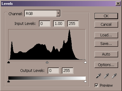
Tool #1 - Levels
The Levels Control is another way to modify the color in an image. Like curves,
Levels also lets you change the color across the tonal range, modifying a
composite image or individual color channels. The dialog features a histogram
method of displaying image data that is unique and sometimes useful. It shows
the full range of tonal values, from light to dark, on a linear scale. A graph
rises and falls across that scale, indicating the actual number of pixels in the
image that have the corresponding value. Therefore, as a general rule you would
want a nice rounded curve that is highest in the mid-tones, with good
representation in the highlight and shadow ends of the spectrum.
The Levels control uses highlight, midpoint, and shadow slides, which shift the
image values in the histogram, lightening or darkening the image. I find this
three variable approach limiting compared to the unlimited number of points I
can place and manipulate on a curve. On the other hand, until I became
comfortable with color numbers, Levels was my main color control. It also allows
you to set white and black points, and delivers decent results for basic to
intermediate changes.
Tool #2- Auto Levels/Color
This approach automatically optimizes the image in a basic way, setting a white point and black point and distributing the mid values throughout the range. There is no dialog box here, just select the menu command and see what it does. For decent photos it can make them better with a mouse click. Be prepared to hit Undo, however, as this ones misses the mark as often as it hits it.
Tool #3- Curves
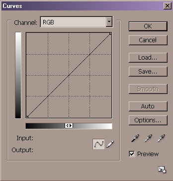
Curves are the mother of all color correction controls. If I were trapped on a desert island with just one color correction tool to my name, it would be Curves. The reason is that Curves allow pinpoint control over the entire color spectrum of the image, letting you be as general or specific as you want to be. It also demands the most color knowledge from you, asking that you at least have a basic understanding of numeric color values and channel separations.
If you don't want to get into that stuff, start by trying one of the alternative methods outlined elsewhere in this article. They're much more forgiving of common mistakes. Curves let you modify the entire image, or just one of the color channels, changing the highlights, mid-tones, or shadows in the image. As we've seen from previous techniques, it¹s also a great place to set white point and black point changes for quick color cast corrections.
Tools #4 - Color Balance
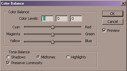
Color Balance- is a finesse control. It makes subtle color cast changes within the highlights, mid-tones, or shadows of an image. It demonstrates the relative nature of color very well, as it presents three sliders that represent the different color polarities. Move the slider towards the red, and conversely away from the cyan, and see the effect it has in real time.
Tools #5-Brightness / Contrast
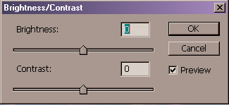
Brightness/Contrast-, it doesn't get any more basic that this. One slider controls the brightness, the other the contrast. In fairness, this one doesn't even deserve to be called a color control, since it does not allow specific color changes. Move past this control as fast as you can.
Tool #6- Hue / Saturation
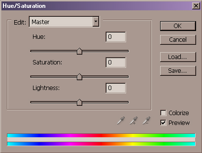
Hue Saturation shifts entire ranges of color within the image. It offers sliders that control the Hue, Saturation, and Lightness in the image, as well as color spectrum bars that show the current image values, as well as color modifications. Move the Hue slider and the lower spectrum bar shifts, showing the color range that replaces the current one.
A great feature in this control set is the Colorize checkbox, which converts the image to a single hue. Moving the Hue slider lets you choose a specific color, while Saturation and Lightness control the intensity and brightness of the color values.
This control is great for making pure color changes, such as adding a graphic color effect, swapping a color, or creating bright, over-saturated colors. It resists naturalistic changes leaving those tasks to Curves or Levels.
Tool #7 & 8-
Desaturate & Replace Color
Desaturate- This menu command eliminates all color in the image, reducing everything to Black and White. No controls in this one, just select the command and stand back.
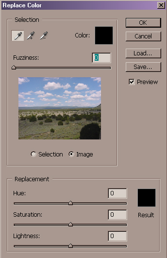
Replace Color- A relative of Hue/Saturation, Replace Color lets you define a color range within an image and modify or replace it. It shows you a thumbnail of the image, allowing you to select portions of it with an eyedropper. A slider adjusts the range of selection, which is updated in the thumbnail image. Once selected, the standard Hue/Saturation tools let you shift Hue, Saturation, or Lightness. This is a good control that lets you select an area by color, and then apply either a radical color shift or a subtle change in intensity.
Tool #9- Channel Mixer
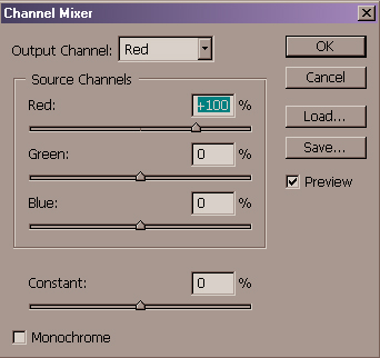
A channel is comprised of grayscale data representing the tonal range of the channel. This control lets you select a target channel to modify adding percentages of the other channels in the file to the target. The thing to remember here is that you are not adding the color itself…you are only adding the grayscale values to the channel. For example, you can select the red channel to modify, and then increase the green channel slider. Does the image turn green? No, it turns either red or cyan. You add the grayscale values from the green channel to the red one, which makes it either more or less red, depending on what’s in the green channel.
You may have an image with strong color in a particular area. Combining one
color channel to another lets you balance the color in that area. I’m on the
fence on this one…I’m not sure if this is a niche control that is useful, or if
its just the result of engineers doing something just because they can.
Tool #10- Variations
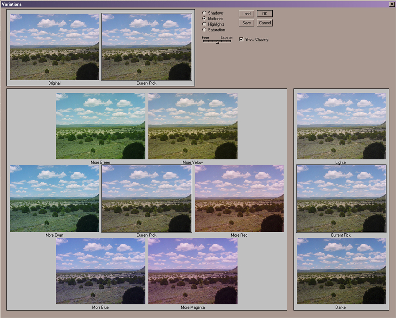
Variations displays thumbnails of the current image in a color wheel array. The
main image thumbnail is in the center, surrounded by variations that are more
blue, yellow, red, etc. Click on a variation and the color is added, and the
thumbnails shift to reflect the new color relationships.
A slider controls the degree of color change, and there is also a lightness/darkness thumbnail set that does not change color.
You can select colors and evaluate the results in real time. Add red and see the
cyan drop out, add blue and watch the yellow diminish. If you get confused about
how colors relate to each other, stop in here for a refresher course.
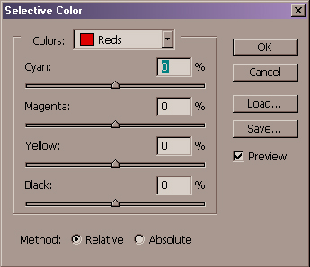
Selective Color
(Image>Adjust>Selective Color)