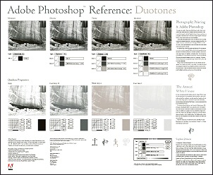
Duotones in Photoshop
And Tritones and Quadtones
https://helpx.adobe.com/photoshop/using/duotones.html
Contrary to popular opinion, those 'classy' black & white photos taken for glossy magazines and media shoots are rarely ever purely black & white (i.e. monotone). Even the best industry-standard printers have great difficulty printing more than 50 distinct shades of grey. To enhance this greatly and improve underlying tonal quality, a second color is often added, making the image two-color (or 'Duotone').
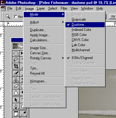
Did you ever see the word Duotone under Image / Mode in Photoshop and wonder what it did? Did you ever wonder how to get the equivalent of sepia toned, selenium toned or gold toned B&W prints from your inkjet printer?
Duotones, and as you'll soon see Tritones and Quadtones, derive from the graphic art world. But as you may have already discovered, many of the powerful features in Photoshop which were originally intended for graphic artists and printers are actually of considerable utility and interest to photographers.
Understanding What a Duotone Is
A Duotone is a wonderful way to make a monochrome print. Experienced printers know that Epson's Photo printers, as good as they are — and they are the elite of the inkjet printer world — don't do a terribly good job printing B&W images. The reason for this is that an 8 bit monochrome image has 256 black tones. But the dithering pattern used by inkjet printers can't produce 256 different tones from just 1 shade of black ink. If you print an image in full color mode the printer's software tries to create a monochrome print from the 4 or 6 inks available, but usually produces an unpredictable overall tonal coloration. It just wasn't designed for the job.
A Duotone takes a monochrome grayscale image and allows you to take the tonal range, from lightest tones to darkest, and allocate a different color to specific part of the tonal range.
Typically you'll use black for the shadows and a lighter tone of another color for the midtones and highlights.
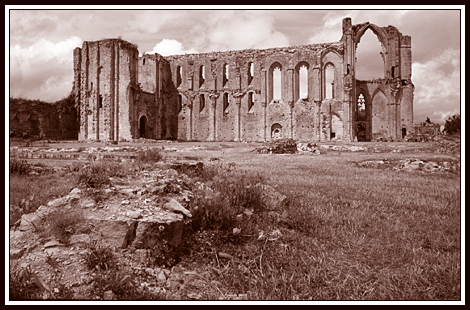
An Example
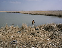
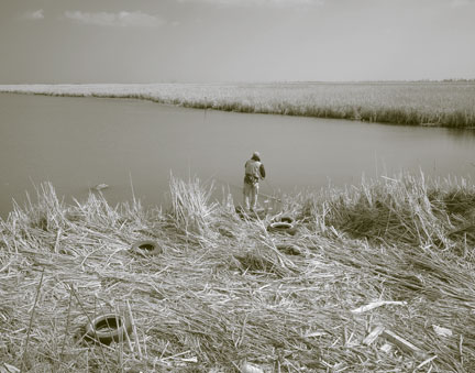
The version you see immediately above is the final Duotone.
Step by Step
The first thing I did was to use Channel Mixer to make it a monochrome image.
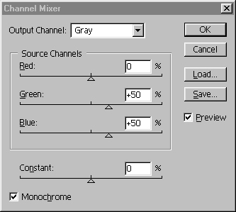
Turn on the Monochrome box and adjust the Red, Green and Blue channel sliders to taste. (Remember that the final combination should add up to around 100%). Click OK. Though the image on-screen appears to be black and white, it isn't — yet. It's still in RGB color mode. To turn it into a Grayscale you now need to use Image / Mode / Grayscale and say Yes to discarding color information.
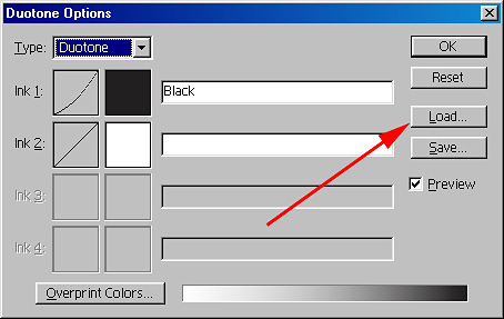
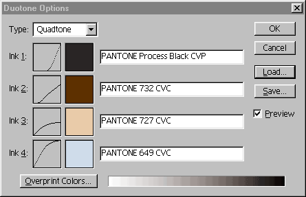
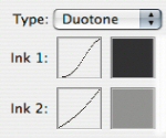
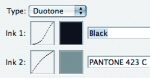
Next, use Image / Mode / Duotone. Click on Load.
Next, click on the 'Load' button
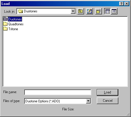
In the 'Load' option box, select 'Duotones' (below)
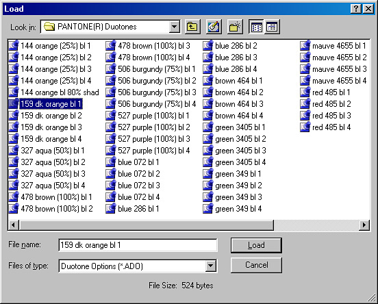
And in the next 'Load' option box (Presets) you'll find three more folders, those of Gray-Black, Pantone and Process Duotones. Choose (for this example) PANTONE Duotones

Open the folder and you'll find lots of
pre-set tones to choose from.
Depending upon the pre-set list you open, some have a descriptive name, others
only a number.
Click on one (say '159dk orange bl1'- below, if you have it on your list), then click the 'Load button. The effect is immediately apparent in your image - that is providing you have the Preview box ticked!
If you wish to choose another option then click 'Load' again and make another selection.
Should you wish to return to the starting point, then in the Duotone Options dialogue box (not the Load dialogue box) hold down the Alt key and notice that the 'Cancel' button changes to 'Reset' - click on this and you have the opening image. Alternatively one can click 'cancel' - but this takes the process back a stage or two and you'll have to re-load via Image > Mode etc.
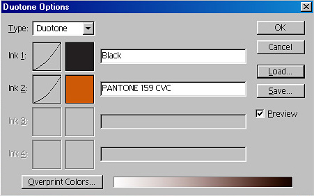
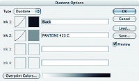
Above: the 'Duotones Options' dialogue box
All very fine so far, but what about
altering the preset Duotone so that it more perfectly meets your requirements?
This can easily be done and the resulting change can be saved for further use.
Making your own Duotone
Using the preset Duotone that we've already experimented with, click on the box
adjacent to 'Ink 2' (A curving line.
When you click on this 'curve' it reveals an expanded view - This is the 'Curve
shape' for this particular color and presents opportunities for modification.
By the way, if you have worked with 'Curves', you'll have a pretty good
understanding of what these curves are all about.
As you work on the curve you can watch the changes in the image.
The curve can also be set by entering numeric values in the boxes presented in
the 'Duotone Curve' box.
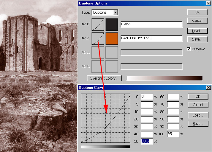
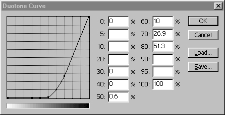
Above:
The 'Duotones Options' dialogue box with the 'Ink 2' curve revealed after
double-clicking on the small curve box next to 'Ink 2'
Saving Your Own Duotone Versions
You may save the particular tone you have made.
Do not save it in the 'Duotone Curve' box (you'll have trouble finding it again,
honest!)
Save the changes in the 'Duotones Options' box - don't forget to give your new
tone a name - this new tone (with its identifying name) will then be added to
the list and you'll find it when opening next time.
More Options
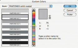
Other combinations and color changes can be made by clicking on the color
square and not the mini curve box. Doing this reveals the 'Custom Colors'
dialogue Box where there is whole spectrum of choice. The 'Book' box shows the
astonishing range available - click on the down arrow to reveal the ranges
available.
Choose a color tone by sliding the twin arrows on the bar up or down and click
OK.
The range of tones to the left give an 'expanded view' of the point where the
sliders are
The effectiveness of the change depends upon the shape of the curve for the
tone. As you know, you can change the shape of the curve.
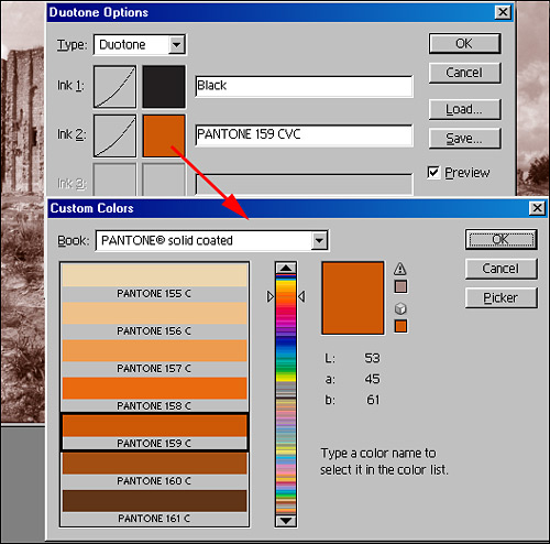
Above: the 'Duotones Options' - 'Custom Colors' dialogue box and one of the many 'Book' ranges to select a color tone from
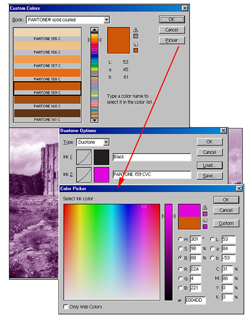
Whilst in the 'Custom Colors' dialogue
box, another option is to click on the 'Picker' box. This reveals the familiar
'Color Picker' dialogue box and here one can move the cursor to any color within
the Photoshop spectrum.
In the example below a lilac shade has been selected (not, of course, to
everyone's taste!)
Printing
Printing Duotones can sometimes be tricky.
The whole Duotone and Pantone system is ideally best suited to high-end
commercial printers. Most of us will be using high grade 'domestic' printers
(the 'domestic' Epson range most likely).
These printers often interpret the Duotone color slightly differently from what
appears on the monitor. To overcome this a little experimentation is necessary.
Sometimes the 'slightly different' tone produced is even more attractive!


If you don't want to experiment too much yourself, go to the Quadtone subdirectory and load some of the Adobe provided files. These are the most sophisticated tone files available. They can be found under Program Files / Adobe / Photoshop 6 / Presets / Duotones / Quadtones / Gray Quadtones.
Speaking of Quadtones, as soon as this tutorial was published I received a number of inquiries about how to design a quad that created the "look" of a traditional selenium toned print.
Below is the recipe for a Quadtone that I simply call Selenium Quad. To recreate it on your machine select the Quadtone subdirectory and then choose the ink colors shown in the screen immediately below. Then click on each curve and type in the numbers that you see in the screen captures below. Please feel free to experiment. There's nothing sacred about either the colors that I chose or the curves applied. I find the result subtle and attractive but you may wish to develop your own with these as a starting point.
 Ink 1
Ink 1
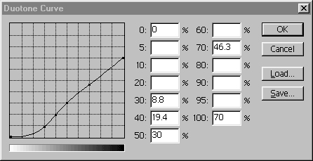 Ink 2
Ink 2
 Ink 3
Ink 3
 Ink 4
Ink 4
Duotones and Photographic Reproduction
By Stephen Johnson
Printing technology has evolved dramatically since Guttenberg and his movable type. After the invention of photography in the 1830s, the desire to reproduce photographs on a printing press was frustrated until the development of the halftone screen in the 1860s. (The effort to develop color printing was its own hill to climb.) But basic photographic reproduction lacked the beauty of the photographs themselves. This challenge was experimented with for most of the 20th century, and by the 1950s and 60s, high-craft multiple-ink printing was being skillfully explored as a means of reproducing fine-art photographs. By the late 1970s, high-end drum scanners and laser-based imagesetters were addressing the issue with even greater potential.
Halftone Reproduction in Black and White Photography
Single-color halftone reproductions of photographs don’t fully imitate the
tonal range of a black-and-white photographic print. Blacks and whites are
sacrificed and turned gray in order to hold detail in both the shadows and
highlights. Duotone, tritone, and quadtone reproduction allows for up to four
printing plates and ink colors to be used to print a black-and-white photograph.
The Photoshop Duotone feature is designed so that up to four inks (with
differing tonal curves and inks) can be applied to a single grayscale image.
Thus the feature allows a high level of customization of ink color and printing
density, which will reproduce rich tonal ranges and imitate color casts that
might be found in historical or toned work.
For example, the use of black ink might be restricted to printing only the
shadow detail and some midtone values, while light gray ink might be used to
print highlights. By distributing different tonal ranges in the print to
specific ink colors, many of the shortcomings of photomechanical reproduction
are overcome. Additionally, the process allows for a great deal of freedom to
reinterpret the photograph on the printing press, because different areas of the
tonal range can be lightened or darkened without effecting other critical areas
in the image.
Duotone Techniques from The Great Central Valley Book
Reproduction of the black-and-white photographs in our book posed a number of challenges. First, the quality of the historic photographs we chose varied widely. Some images had great contrast, while others were quite flat. Nevertheless, I wanted all the images in the book to visually belong together and reproduce as beautifully as possible. I adjusted the scans considerably (and frequently re-scanned), but often the real opportunity to achieve my goal came when creating Duotone curves for reproduction. I was able to create curves that allowed for no black ink in the highlights. The upper ranges of tones were carried entirely by a light gray ink (PMS 423) well suited for the tonal areas it represented.
A Duotone Primer
The main reason to create the Duotone feature was to allow for rich tonal
reproduction of black-and-white photographs on printing presses. It allows
for special colors of ink to be used to customize the reproduction.
Additionally, special colors used on a job can be applied to images for
thematic and tone enrichment purposes.
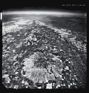
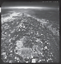
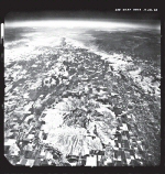
Sacramento Valley from 60,000 feet. 1968. USAF.
Scanner: Agfa Horizon. Source Images: USGS 9x9 inch print.
top: Conventional single color halftone.
lower above: Duotone.
The Methodology
Here’s the basic methodology for creating effective Duotone images:
Progressives (black plate and gray plate) and Duotone curves.
Proofing Duotones
Inkjets do not proof Duotones unless you have the special inks in the
printer and the software to control them. Approximations can be created by
changing the Duotone file to RGB, then printing.
The only prepress proofing that I am aware of that works for Duotones uses
the Cromalin process mixing special colors with toner powders and imaging
from separation film. It is expensive, but does proof your prepress film
with good accuracy.
Checking Duotones on Press
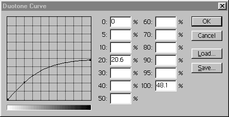
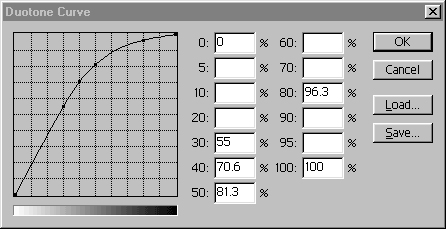
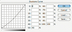
Duotone Curves
A Duotone curve controls the contrast and ink distribution on the
reproduction printing plates. The Duotone mode (under Image > Mode) controls
and previews this function. Editing a Duotone curve can, at first, be a
strange experience—they take a little getting use to. On the upper right of
the curve graphic below is the shadow point (or 100% ink density); on the
lower left are highlights (0%). The shape of the curve determines the
distribution of ink in the image. Unedited digital files open with
straight-line curves, where each of the data points will print as commanded
by the density of the digital information in the file (50% as 50%).
The Curves dialog box essentially lets you remap the distribution of up to four different ink colors applied to the image. If you want the midtones darker in a particular ink color, simply click on that ink’s curve and pull the 50% point on the curve to a higher point on the graph (or type a larger number into the 50% box on the percentage boxes). Conversely, if you want a lighter tonal range, pull the curve downward. The changes you make can be previewed on the screen, in full color, by clicking the Preview checkbox. As I mentioned earlier, I’ve generally achieved the best results by limiting the application of black ink to the shadows and midtones, and calling for a lighter gray ink to carry the highlights.
Photoshop comes with 137 sample curves I wrote for Adobe. These curves are
arranged in Duotone, tritone, and quadtone folders, and are further divided
by black and gray combinations, process colors, and special Pantone ink
combinations. I included multiple versions of many of the Duotone curves, in
a series from 1 to 4, where 1 is the most intense application of the second
color and 4 is the most subtle. My curves should give you some ideas and get
you started, but every photograph needs slightly different treatment—so
experiment.
Duotone Examples
These images are good examples of the range of photographs in the Central
Valley book. The USAF photograph on the opening pages of this chapter had
been printed in the darkroom to reveal maximum information; consequently,
the print was quite gray. I was able to achieve a much wider range of tones
with my custom Duotone curves, building rich blacks and snowy whites into
the reproduction.
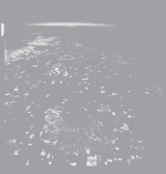
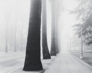
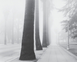
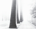
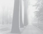
The fog photograph from Sacramento brings back many memories of long foggy winters in the valley. The silvery quality of fog was particularly well suited to letting the gray 423 carry all highlight detail, with a somewhat contrasty black plate deepening the darker values in the trees.
 Duotone.
Fog, Downtown Sacramento, 1989. Stephen Johnson.
Scanner: UMAX 1200, CCD flatbed scanner.
Duotone Separations: Adobe Photoshop.
Source Images: 6x7 Agfapan 25 negative.
 Conventional single color halftone.
Progressives (black plate and gray plate) and duotone curves.
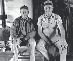
Buck and Tommy, Merced, 1976.
Scanner: Leafscan 45, CCD film scanner.
Duotone Separations: Adobe Photoshop.
Source Images: 4x5 Kodak Plus-X negative.
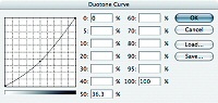
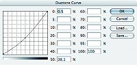
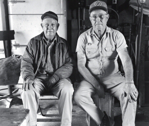
The upper right reproduction used a heavy application of the 423
gray, carrying all of the highlight and most of the midtone values. The
reproduction above (click to enlarge) has a more equal application of
both inks, with less detailed, deeper shadows. These curves using PMS
423 are based on the black/warm gray 8 curves 1 and 4 in the Duotones
folder.