

Contrast
Contrast in composition involves the juxtaposition of elements that are strongly
different from one another.
Contrast is usually discussed in terms of sets of polar opposites:
•
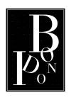
size: large and small
•
shape: curve and straight edge
•
space: positive and negative
•
value: light and dark
![]()
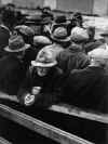 Dorothea Lange White Angel
Bread Line 1932
•
color: warm and cool
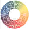 Chevreul's color wheel
 Vincent Van Gogh Fritillaries 1800's
•
rough vs. smooth
•
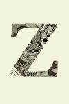
solid vs. patterned
•
simple vs. complex
•
vertical vs. horizontal
•
Contrast is important it allows the designer to:
direct attention to elements, areas, or ideas in the composition that are of
particular importance.
establish a hierarchy of meaning in the composition
 Francisco de Goya The Third of May 1814
•
Certain uses of contrast also have built-in connotations that derive from the
context in which they are used.
•
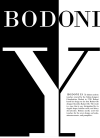
High contrast imagery in which areas compete with one another for
attention can have a jarring effect that implies conflict.
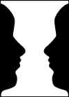 based on Danish psychologist Edgar Rubin's illustration
•
The presence or absence of contrast strongly affects meaning in a composition.
Contrast can also be used to powerful effect as an agent of surprise when we
encounter the unexpected in familiar environments.