
Color: Visual Evaluation
Densitometers, colorimeters, and other instruments provide helpful numeric comparisons, but visual evaluation is equally important. The eye may perceive differences when instrument readings show a match. Unlike instruments that measure color in isolated areas, the eye sees color in the context of surrounding areas, image size, and other factors that can affect human perception of color.
Surround
The same colors appear lighter against a black background than they do on a white background.Surrounding colors influence perception. Instrument readings say that these two pictures are the same color, yet they look different because of the colors that surround them.
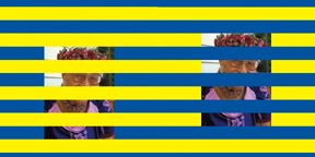
Image size
Smaller images appear darker when they have a light surround.
Image sharpness
Sharper images tend to appear brighter and higher in contrast than soft focus imagesLight sources
Some hues shift more than others when the color of the light source changes. Example: purple = blue + red. Blue dominates in daylight. Red dominates in tungsten light.
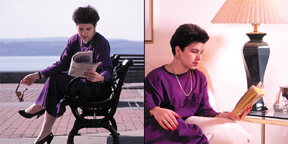
Adaptation
Chromatic adaptation automatically adjusts our perception. The eye has a strong tendency to cancel out overall color shifts. Visual data is processed, comparing adjacent colors in the scene, with white as the strongest reference point, so purple looks purple in daylight or tungsten light.Metamerism
Two colors that look the same under one light source may look different under another light source because of spectral distribution differences. Standard viewing conditions minimize this problem.Some colors are especially difficult to reproduce in CMYK.
Grays
When adjustments are made to CMY inks, gray balance will shift. Even a 1% change in C, M or Y ink will be visible in neutral gray areas. This is why most process control bars include gray strips or patches.
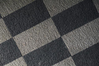
Pastels and light screen tints
Color shifts are more apparent in near-neutrals than in saturated colors. What the eye sees in light areas is mostly paper vs. ink, so the appearance of the image can be heavily influenced by paper characteristics. In addition, dot gain in highlight areas has a greater visual impact than in midtone or shadow areas.

Purples / violets
Rich, vibrant purples are notoriously tough to match and, in some cases, may be outside the gamut of colors achievable in CMYK. Purples are reddish-blues. A slight shift toward either red or blue has a strong effect on final color. These hues are very sensitive to viewing conditions, appearing redder under warm light and bluer under cool light.

Metallics / fluorescents
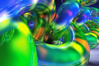
Some metallic colors, especially gold (jewelry, gold lamé fabric), are simply impossible to match using CMYK. Some gemstones, such as emeralds and garnets, also fall outside the gamut of 4-color process printing. Special metallic or fluorescent inks should be used.

Color Bars
Color bars don't take up much space, but they speak volumes. They are an essential control tool on press sheets and contract proofs. Standard versions are available from GATF and others, but printers often create customized color bars to meet their own requirements. Color patches may be assessed visually or read with a densitometer.1. Color bars are usually placed on the tail edge and run the entire length of the sheet, to check variability across the press sheet.
2. Solids and screens of the same color are used to check dot gain.
3. Patches of 100% C, M, Y, and K are used to check solid ink density.
4. Gray squares are used to check color balance.
5. Slur targets are used to check for movement of the plate or sheet. The GATF Star Target is used to detect slur, as well as dot gain, and image doubling and spreading.
6. Overprints are used to check registration and trapping.