Color Context/Simultaneous Contrast
![]() https://colorusage.arc.nasa.gov/index.php
https://colorusage.arc.nasa.gov/index.php
Observing the effects colors have on each other is the starting point for understanding the relativity of color. The relationship of values, saturations and the warmth or coolness of respective hues can cause noticeable differences in our perception of color.
Two colors, side by side, interact with one another and change our perception accordingly. The effect of this interaction is called simultaneous contrast. Since we rarely see colors in isolation, simultaneous contrast affects our sense of the color that we see.
For example, red and blue flowerbeds in a garden are modified where they border each other: the blue appears green and the red, orange. The real colors are not altered; only our perception of them changes.
Simultaneous contrast is most intense when the two colors are complementary colors. Complementary colors are pairs of colors, diametrically opposite on a color circle: as seen in Newton’s color circle, red and green, and blue and yellow. Yellow complements blue; mixed yellow and blue lights generate white light.
Impressionist interest in color and light is influenced in part by the research of scientists like Michel Chevreul. Specifically, the idea that an object of any given color will cast a shadow tinged with that of its complementary color and tinting neighboring colors in the same manner.
This theory was already known to earlier painters, such as Eugène Delacroix. A primary color such as red has green (the combination of the other two primaries) as its complementary. Similarly, blue has orange and yellow has purple as a complementary color.
Few artists have dramatically used complementary colors as has Vincent van Gogh (1853-1890), illustrated below. Both works were painted in Arles in 1888.

Our sensation is the most intense where two extremes are juxtaposed. Van Gogh’s Night Cafe composes colors described as “warm,” which are generally associated with such sensations and emotions as energy, joy, love and festivity. In his letter to his brother Theo, van Gogh considers the work as “…one of the ugliest (pictures) I have done… I have tried to express the terrible passions of humanity by means of red and green.” By using color in this manner, van Gogh exploits the psychological capacities of colors to arouse emotions, here intentionally creating a jarring unpleasant sensation for the viewer.
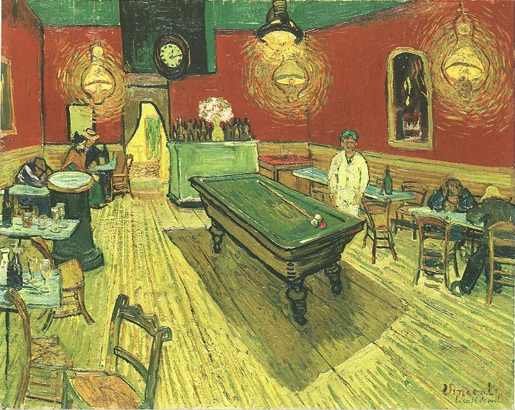 Night Cafe 1888 Sept
Simultaneous contrast applies not just to sight but also to the senses of touch and taste. Jumping out of a sauna into a cold pool accentuates the coldness. Drinking orange juice after eating pancakes and sweet maple syrup accentuates the acidity of the juice.
Color interaction was first put on a sound experimental base by the French chemist Michel Chevreul (1786-1889). Chevreul was hired by the Gobelin Tapestry factory to investigate the fading of their tapestry threads.
In his 1839 book, De la Loi du Contraste Simultané des Couleurs, Chevreul shows that the fading is not fading at all, but instead due to simultaneous contrast between adjacent colored threads. Successive contrast, such as that used by the 20th century painter Bridget Riley, is the complement of simultaneous contrast but delayed in time. Both have the same neurophysiological basis of retinal fatigue.
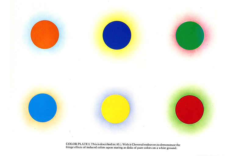
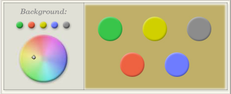
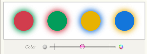
Move the knob in the diagram below to see how Chevreul illustrated the effect of a surround on the vividness of colored circles.
Click for SWF file....
Hue:
Hue is the most obvious characteristic of a color. There is really an infinite number of possible hues. A full range of hues exists, for example, between red and yellow. In the middle of that range are all the orange hues. Similarly, there is a range of hues between any other two hues. The color wheel shows each of the six colors with medium value, and relatively high chroma.
Chroma:
Chroma is the purity of a color. High chroma colors look rich and full. Low chroma colors look dull and grayish. Sometimes chroma is called saturation.
Value:
Value is the lightness or darkness of a color. Sometimes light colors are called tints, and dark colors are called shades. All high chroma colors must necessarily be medium in value.
Lightness
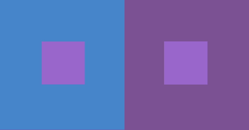
By far the most powerful example of simultaneous contrast is the apparent shift in lightness of identical mid valued squares surrounded by a color of darker or lighter tonal value. If the surrounding color is darker, the central square appears lighter; if the surrounding color is lighter, the central square appears darker.

color shift in a simultaneous lightness contrast, all large and small squares have the same hue and chroma
This illusion is normally demonstrated using different shades of gray, to cancel the effects of hue and chroma. But the example shows that it also works for shades of blue (or any other color) that have exactly the same hue and chroma, but differ widely in luminosity.
Within each large square, the average lightness is based on the outer and inner squares. Contrast is increased around this local average, shifting the apparent value of the smaller squares in opposite directions. This also means that the two larger squares both appear darker than they would in other settings, because they are shifted to contrast with the white background of the page.
This value shift is the easiest visual illusion to elicit. In fact, many people will not believe that the two central squares are really the same lightness. The illusion is so powerful because value dominates our visual experience.
Crispening Effect
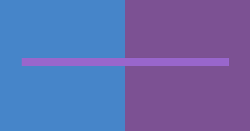
A special case of lightness contrast is the crispening effect, which increases the apparent contrast between two colors of similar lightness against a surround lightness of value between them.
The schematic at below shows the basic effect: the perceived lightness contrast between grayscale steps amplified around the average lightness of the background. All the lighter values are compressed slightly toward white, and match the nominal white at the lightest step of the scale; the darker values are compressed slightly toward black. This shift is strongest within a one half Munsell value step on either side of the background value, and then becomes constant for the rest of the scale.
 the apparent contrast is greatest around the value of the background

Bartleson-Breneman Effect
A related effect appears in the perceived contrast among areas of different value within an image when the image is viewed against a light or dark valued background.
The Bartleson-Breneman effect is well known in imaging studies: as the background becomes darker, the induced lightening in the image (called the "complex stimulus") causes all the values to appear lighter; but this has the greatest impact on the darkest values, which compresses the value range and makes the steps between gray values appear smaller. Against a light valued background the lightness contrast causes the image values to appear darker, but again this has the greatest impact on the darker values, causing them to darken and causing the value steps between grays to widen.

In this example, the value series on the left appears closer together because the background or surround is very dark. On the right, the same values appear more greatly contrasted because the surround is relatively light valued. Note that the induced change becomes more noticeable as the values get darker.
Chroma
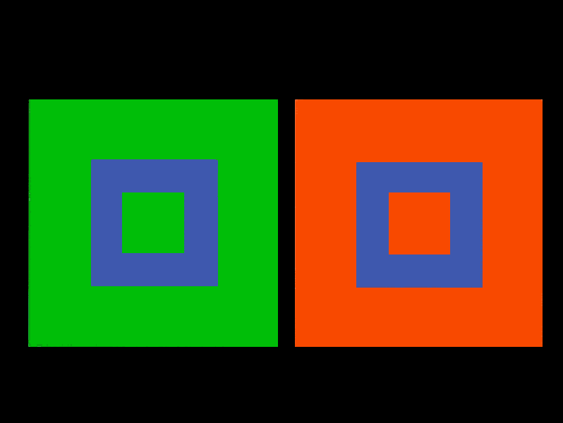
The next strongest visual effect is the apparent shift in Chroma of identical colored squares. In the illustration, the central squares are moderately unsaturated (Chroma 55), and the surrounding colors are either dull (Chroma 30) or intense (Chroma 100). All squares have exactly the same lightness (L = 60) and hue (red violet).

The difference in chroma alone is enough to
cause an obvious color shift: the small square on the right appears darker and
duller, while the square on the left appears lighter and more intense.
These unexpected apparent value shifts — unexpected because the larger squares are exactly the same lightness and hue — occur because the violet on the right seems to be a brighter color. The eye incorporates this information in the darkness it attributes to the inner squares because value and chroma are often confused in color perception.

lightness shift in a simultaneous chroma contrast
inner and outer squares are matched on
lightness
Helmholtz-Kohlrausch Effect
We can bring into this overview of luminosity shifts in color the fact that increased chroma increases apparent color luminosity, which is known as the Helmholtz-Kohlrausch effect. This applies both to lights and to object colors, and is a kind of reciprocal statement of the Hunt effect.
Finally, the central square can be surrounded by colors contrasted in hue but identical in chroma and lightness. According to "color theory," a complementary shift in hue should appear. In practice, I've found this hue shift is hard to demonstrate. After a lot of experimenting, I found a contrast that does seem to work: a smaller square of green within larger squares of yellow and turquoise (all squares have a lightness of 90 and chroma of 80).

color shift in a simultaneous hue contrast
These hue shifts can often involve complex
changes on both hue and chroma, but these can be conveniently worked out on a standard color
wheel, according to the simple rule of the mixture of contrasted
complements enunciated by Michel-Eugène
Chevreul: if two colors are placed side by side, each color shifts as if
mixed with the visual complement of the contrasting color. Thus, the green
square surrounded by yellow should hue shift as if it were mixed with the visual
complement of the yellow, or blue violet; the green square within turquoise
should hue shift as if mixed with the visual complement of turquoise, or middle
red. (Both the yellow and turquoise should shift as if tinted with the visual
complement of green, or purple.)
Unfortunately, I don't see anything like those hue shifts here; the central squares seem roughly the same hue to me. In fact, the small green square on the left looks more intense, lighter valued, and shifted slightly toward yellow — even though "color theory" predicts it should appear less intense and shifted toward blue violet. This color shift is what we would expect in a chroma contrast, and it may happen because the chroma of 80 is enough to make the yellow appear duller than the turquoise, even though the lightness of the two colors is the same.

color shift in a simultaneous hue contrast
all large and small squares have the same
chroma and lightness
Here is another example, this time with red
violet against orange or blue. In this example the hue does seem slightly bluer
within the orange square, but again the predominant effect seems to be a
lightness or chroma shift, making the left square appear brighter and more
intense than the right.
The difficulty in finding a hue contrast that works on its own arises because the relationship between chroma and lightness changes radically from one hue to the next, and the eye tends to overestimate the lightness of some hues (deep reds and blues) and underestimate the lightness of others (yellows and greens). With all that going on at the same time, it's not easy to find three contrasting hues that can be subjectively equated on both chroma and lightness. With few exceptions, the "color theory" books you'll encounter do not bother with these distinctions, and therefore mislead you on the true nature of visual contrasts. But I repeat: hue is the weakest component of visual contrast, when compared with the impact of lightness and chroma.
Some of the early color texts (including Michel-Eugène Chevreul and Ogden Rood) are careful to explain that these contrast effects tend to appear in certain situations but not others.
According to Rood, the shift color (the color in the central square, which can be expected to shift) should be unsaturated and mid valued, and it should be surrounded by a single strongly saturated color. If the shift color has a high chroma or is either very light or very dark valued, the apparent shift is usually reduced. Hue contrasts will also vary depending on the relative color distance between the two contrast colors (in this, case, between the central square and its background): a greater color distance should produce a larger color shift.

color shift in a simultaneous hue contrast
central squares set to low chroma and mid
value; outer squares are both at lightness of 70 and chroma of 90
Here's the previous hue shift in "enhanced" form — complementary background colors, and neutralized central squares — so you can judge the difference for yourself. I see primarily an apparent value or chroma contrast between the two central squares, with a small hue shift toward blue in the square surrounded by orange, and toward yellow in the square surrounded by blue. But, again, the hue shift by itself is very small.
Compare the contrast effects of different color backgrounds for the same color square.
Three color studies based on Josef Albers' Interaction of Color
based on Johannes Itten