
Visually Critiquing Web Pages
Pete Faraday
Microsoft Corp,
Redmond, WA, USA 98058
Visually Critiquing Web Pages
Pete Faraday
Microsoft Corp,
Redmond, WA, USA 98058
Abstract.
This paper explores how visual information is organized in a web page. A cognitive framework is outlined for how web pages are processed into a visual hierarchy. The guidelines derived are implemented as rules in a critiquing system and embedded in a web editing tool, allowing the user to spot potential design problems. The paper concludes with a critique of two well known web pages.
1. Introduction
What makes some web pages easy to understand, whilst others appear as a complex jumble ? Several writers have pin-pointed the design of the page as being of key importance. Yales style guide [14] suggests Overuse of graphic emphasis leads to a clowns pants effect where everything is garish and nothing is really emphasized Meads [16] agrees that web pages that dazzle the user can also be distracting and can hide important information... they can make text unreadable and turn off a viewer. Fleming [9] admits that rather than being seen as a solution to some of the webs usability problems, graphic design is often regarded as their source churning out useless visual distractions that glitter and sparkle on the screen.
The first question is, how can we develop a framework to explain effective web page design ? Bernstein [3] suggests problems with applying subjective ratings of sites : 'critical judgements are inevitably open to censure as arising from personal affection, idiosyncrasy, affinity or poor judgement'. However, Bernstein also concludes that usability tests are not in themselves the answer : 'usability testing can reveal flaws in poorly designed pages.. but can not prove that the pages are well executed'.
We argue that the process of viewing a web page is a cognitive one, and that in order to understand 'good design', we must first understand these cognitive processes. Web pages are made up of a complex combination of perceptual elements: static and animated media, text and image; in different sizes, different colors, font styles, groupings and spatial layouts. This paper reviews cognitive studies to explore how these variables can be used to guide the viewer through the web page, providing them with an ordered visual hierarchy of information. We claim that the ordering of this hierarchy should match the content being communicated. Tufte [21] suggests that 'contrasts of elements will tend to produce a visual hierarchy, with layers of inactive background, against notable content. When everything is emphasized, nothing is emphasised; the design will be noisy, cluttered and informationally flat'.
The first section of the paper presents our framework, with each section discussed in terms of relevant studies and our derived guidelines, and their predications compared to existing web page design heuristics. A case study example of a company home page is used to motivate our guidelines. The second section uses the framework as the basis for a critiquing system. This provides the designer with a web page layout and editing tool that attempts to predict the viewing order of the page using a set of rules.
2 Case Study Example
The paper is illustrated by an example for a company home page. This is shown in figure 1 (the new.gif image is shown animating when the page loads).
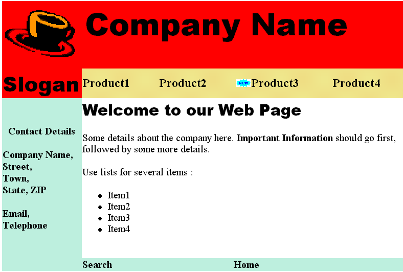
Figure 1 Company home page. The new .gif is shown animating. Try squinting at it to see it as a set of perceptual elements.
This web page has a number of levels of information, such as the company identity, a welcome message, links to its products, and contact details. The designer may intend certain information to be more important eg a new product is more important than the old; or the companies name is more important than their telephone number. The role of the example in this paper is not to typify good design, but to illustrate our guidelines.
3 Cognitive Framework
We suggest the visual processing of web pages forms a distinct visual hierarchy in which certain perceptual elements have priority. We divide the process of reading a web page into two phases : the first phase is termed search, the second is scanning. The search phase takes place when the viewer attempts to find a salient entry point into the page. Once an entry point is found, the scanning phase is then used to extract the information.
3.1 Search
The first search phase decides where attention should enter the page. The guidelines that we have identified for the search phase are ordered as follows:
i) Motion :
The most important variable in the search phase is motion. Triesman [20] suggests that motion is detected within the region fixated upon by the eye by low level receptors. She notes that motion detection is automatic, causing the object in motion to pop out of the display.
Several web page design heuristics note motion as being a strong cue. Fleming [9] suggests that movement draws our attention; used judiciously and with purpose, animation can be an exciting and effective way to communicate information However, Yale [14] cautions animation should be meaningful, not distracting. Ideally, it should add something to the content of your page.
In the case study example shown in figure 1, the animated new .gif would dominate over the rest of the page, drawing attention to it before any other elements.
ii) Size :
The second place variable in our hierarchy is size. Bertin [4] provides a list of retinal variables, suggesting that size is most important. Support for this claim can be found in Arnheim [2], who notes that larger objects will be focused on in preference to smaller. Empirical evidence for the importance of size is given by eye tracking studies undertaken by Yarbus [24]. He showed that larger objects had primacy in pictorial items, and that the user would fixate on them first, and for longer than smaller displays.
Our guideline here is that larger elements will be attended to over smaller elements. Two sets of web page heuristics support this. Ameritech [1] note in general, the larger an item is, the greater its perceive visual importance and likelihood of attracting attention. Make sure that items of greatest importance are easy to see. Fleming [9] agrees, suggesting that larger items will generally draw attention first and be seen as the more important elements on the screen; when these clues are not available, sorting through the information can be an overwhelming experience.
In the case of figure 1, the size of the Company name text and the company logo image would make them equally dominant over other static items in the page, since they are the same height.
iii) Images :
The third variable is the use of images. Stone & Glock [25] performed an eye tracking study of subjects reading a set of instructions. They found that subjects first looked at the illustration for 1-2 seconds, then the text caption. Brandt [5] provides some empirical evidence that graphics and images are attended to in preference to text. He performed a number of eye tracking studies of newspaper pages. He concludes that 'pictures and figures have an exceedingly high attentional value; reading copy is only a last resort in many cases.'
Our guideline here is that images will be attended to in preference to text. Yales web page guidelines [14] note that viewers begin to pick out specific information, first from graphics, and only afterward do they start parsing the harder medium of text. [22] proposes that graphics should be used to attract attention to the target area.
In figure 1, company logo .gif would dominate over the company name text. This means that attention will search into the image prior to the text.
iv) Color :
Where several elements have a similar size, color can be used to discriminate which element is most important. Arnheim [2] suggests that parts of images which are more brightly colored will gain focus : Bright colors are heavier than dark ones. Triesman [20] concludes that differences in surface characteristics such as color and brightness can provide cues for visual search.
Our guidelines here is that brighter colored elements will dominate over darker. Flemings guidelines [9] agree that color and contrast also show relationships between items and establish importance, a highlight color on a page tends to draw the eye.
v) Text style :
The fifth place variable concerns text styles, such as font and type format. Glynn et al [10]; Lewis & Walker [6] propose that physical typeface information may be attended to. Glynn et al note that certain type styles, such as type face, weight or font size, italics, underlining become part of meaning of the text, or provide a 'typeface personality' upon the text: 'typographical cueing systems are nonverbal devices for attracting and focusing the readers attention.'
Web page guidelines also suggest text style as being useful to draw attention to important words. Nielsen [17] offers that hypertext links serve as one kind of highlighting ; typeface variations and colors are another. Yale [14] agrees that Editorial landmarks like titles and headers are the fundamental human interface issue in web pages.
vi) Position :
Finally we use position to arbitrate an entry point if the size, type, color and style can not make a distinction. [15] suggest that a page of text is viewed at a number of granularities, with a top-left bias in selecting where reading should begin. However, [2] notes that in non text displays, the center will be dominant; and that if a number of images are shown, factors such as symmetry will displace the center.
For simplicity, our guidelines favor elements at the top and left of the page, based on reading order. Fleming [9] concurs items placed to the left and top of centre tend to be noticed first and are considered more important. C-NET [7] notes that in page layout, the top of the page is always more dominant.
3.2 Scanning
Having located an entry point into the page during the search phase, the second phase now produces scanning of the area which contains the entry point :
i) Area :
Wertheimer [22] argues that elements are grouped according to Figure and Ground relationships, forming a Gestalt. Figure elements are completely enclosed by other ground elements, which cause them to grouped, and separated from other figure objects. Arnheim [2] notes that 'Area establishes a hierarchy by creating distinction. A scale of importance leads through intervening steps, from foreground to background.'
The web page guidelines also suggest that grouping is important. Fleming [9] proposes that grouping or placing elements in proximity provides information about there relationship C-NET[7] notes that colored backgrounds and table cells can lead the readers eye down the page. Ameritech [1] agrees that Items which share the same color will typically be seen as relating to each other
In figure 1, we would predict that the animated new gif would attract attention into the upper product name area; scanning would then proceed in this area until the elements enclosed within it had been viewed. Thus the product names are likely to be viewed before the name of the company, or the welcome text.
ii) Proximity & Reading Order :
Wertheimer [22] defines that proximity describes the tendency of individual elements to be associated more strongly with nearby elements than those which are farther away. Our guideline here is that elements which are in close proximity will be grouped together; and that grouping will follow a reading order, moving from left to right, and top to bottom.
Several web page heuristics acknowledge reading order as being useful. Fleming [9] notes placement or position can suggest the relative importance or sequence in which we are meant to digest them. Yale [14] suggests that readers of English read from left to right and from the top of the page to the bottom this fundamental axis dominates most design decisions
In figure 1, the animated new gif will set an entry point into the image, with the order then being set from left to right and top to bottom with elements in proximity of the product name area.
4. Web Page Critiquing Tool
A significant difficulty with design or evaluation using our visual hierarchy guidelines is the time it takes to perform the analysis. Authors of web pages are used to being able to rapidly change a page : eg re-format and move elements around the page. Predicting a problem leads to the need to change the web page, and thus requires further iterations of evaluation and design improvement. The time and effort consumed makes paper based guidelines unwieldy for real world use.
Our answer to these problems has been to embed the guidelines within a tool, enabling the generation of the visual hierarchy to be automated. The notion of a 'critic' is similar to Fischer [8] who defined critic based advisors that do not automate design, but attempt to spot and alert users to design problems which they can then fix.
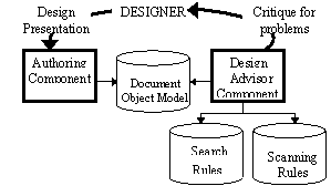
Figure 3 Architecture.
A prototype tool was built in Visual C++ and AMZI prolog under Windows 98. It has two main components, shown in figure 3. The web page editor is used by the designer to manipulate the page. This makes use of the Internet Explorer 5 editing component to provide WYSIWYG page manipulation. The visual hierarchy is produced using a set of rules which search the document object model in a priority order, based on the search guidelines.
5. Rule Implementation
The critic components were built in prolog. The rules used to produce the visual hierarchy and to critique it will now be described in more detail :
a) Initialize : The first set of rules are used to initialize the visual hierarchy search. Rules are defined to parse out the HTML tags into visual elements, and to combine tags which refer to the same visual element. The result is a set of facts which refer to visual elements by screen location, color, size, media type, and style.
b) Search phase : The next set of rules search through the elements, seeking components which could potentially be in focus. A particular element is selected based on the following rules
ii) Size : the next rules use height as a surrogate for area to determine which element is the largest. This is because it is difficult to accurately find an average screen area of a word in a line of text. If several candidate elements are the same height, then rules iii)-v) are used. In figure 2, the rules determine that the Welcome.. text is an entry point in the lower area over Contact details because of the larger height of the font.
iii) Images : these rules are used to search for images over text. If several text elements are found then rules iv) and v) are applied. If several image elements are found of the same size, then rule vi) is applied. In figure 2, the coffee cup .gif is used as an entry point in the top area because these rules favor images.
iv) Color : the rules favor brighter colored text over darker, or the default black text. Our current implementation does not extract an average color value from images, so we are unable to compare image color in the critique.
v)Text style : The rules ignore the default paragraph style, searching for areas of importance in the text. They favor hyperlinks, then bold, then italic and underline.
vi) Position : the rules favor the top of the screen and left of the
screen, over the bottom and right. This is based on the reading order of
the page, and provides a default entry point into the page if all of the
elements do not differ across any of the rules in i) to v).
ii) Proximity & Order : Within any area found, the rules now simulate a reading order from left to right and top to bottom, starting from the entry point. This is based on the reading order for english, and assumes that once an entry point is found by the search phase, ordered scanning will then take place. These rules treat an image as a single whole, and ignore any text which is not formatted using color or text style or formatting to draw attention.
iii) Recurse into Search Phase: When the bottom-right of the current area is reached, the rules recurse back into the search phase to find another element to act as an entry point. A separate set of rules biases search toward areas of color which are the same as the last area which the viewer scanned eg if the Area rules finds that an element is enclosed in a red area, then red areas will gain priority in the next search phase. This allows areas of color to specify paths, which will be searched in preference to other areas. In figure 2, the recursive search causes areas of similar background color to that found enclosing the animated new.gif to be searched. This is why Product 1 is found as an entry point over the larger text and images elsewhere on the page.
Several examples of how the rules critique the company home page are described in figure 2-3. The arrows and numbers on the page show the output of the critique, giving the predicted viewing order.
In figure 2, the animated new.gif provides an entry point during the search phase within the product name area; the scanning rules then expand into the product name area, and the reading order causes 'Product 3' and Product 4 to be read. Recursion then takes search back to Product 1, since it shares a background color with Product 3 The next phase of search moves to the company logo area because of the image, with the image dominating over the text. Reading goes left to the 'Company Name', then down to the slogan. Search then enters at the Welcome message because its font is larger than the that of Contact Details. The highlighted text and bullet points are then searched; the non formatted text is ignored. Finally 'Contact details' is found. Since all of Contact Details text is the same size and formatted in bold, search defaults to entering at the top-left of the area.
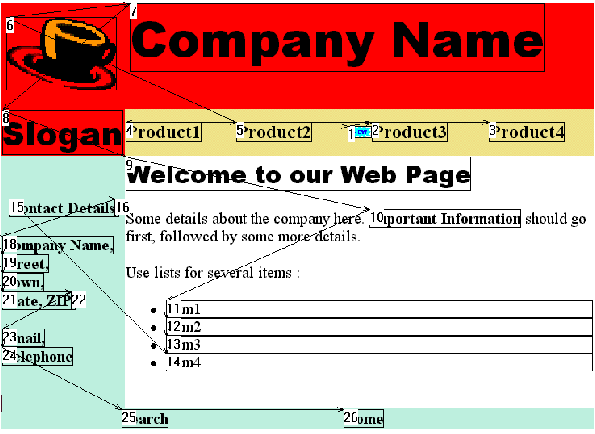
Figure 2 Critique of the web page shown in figure 1.The numbers and arrows show the critiquers predicted viewing
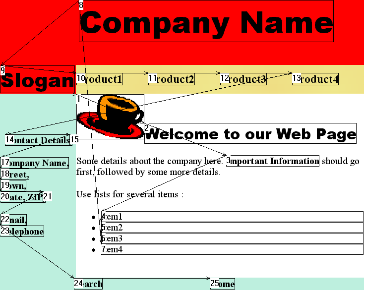
Figure 3 Edited page : the company logo .gif is moved and animated new.gif is deleted
Because the critiquing rules directly access the document object model, they can monitor changes made when the user edits the web page. In figure 3, the user deletes the animated gif and moves the cup image down next to the welcome message changes the reading order considerably. The search phase finds the cup image is now dominant over the other static text elements. This causes search to enter the Welcome area. The scanning rules then run through the welcome text; only the formatted or bullet pointed text are picked out. The next phase of search then enters the company name area because the Company Name is in a larger font than any of the other text on the page. Contact Details are found last.
7. Real world examples
Whilst the tool is currently designed to critique relatively simple web pages, we have begun to scale up the rules to allow it cope with more complex pages. Figure 6 shows Jakob Nielsens Useit web page, http://www.useit.com. First, note how Nielsens large colored useit.com Jakob Nielsens Website upper title acts as the entry point, but the down and left order of reading causes the top-left title Usable Information Technology to be neglected.
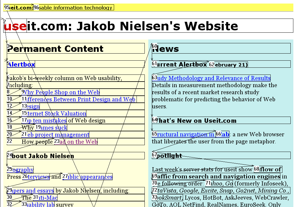
Figure 6 Critique of Jakob Nielsens Useit.com
Also of interest is how the table columns separate out the content, and how the critique ignores the body text in favor of scanning the lists, bold text and hyperlinks. The critique suggests a problem that the News title is less dominant than the Permanent Collection. Nielsen might consider swapping the ordering on the page, making the News title bigger or colored, or using a graphic to guide attention to the new content.
Figure 7 shows an example critique of the SIGCHI CHI 99 home page, http://www.acm.org/sigchi. Note in this case the effect of the larger SIGCHI logo on the far right. This acts as an entry point, causing reading to then have to move back in an unnatural right to left order to get to the smaller icons. Next, search moves to the right hand side table, because of its larger red label for SIGCHI news. Examining the critique suggests a problem in the complete neglect of the explanatory paragraph ACM SIGCHI brings together below the title area. The lack of any formatting to make this stand out over the busy means the information about the purpose of SIGCHI is likely to be missed.
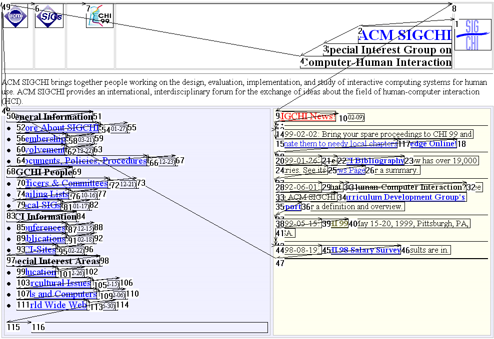
Figure 7 CHI 99 home page.
8. Current Work & Conclusions
We believe that our tool provides considerable value in its visual critique of web pages, particularly for novice designers. By automating this process via our visual hierarchy rules, we can gain a greater understanding of what good web page design means.
The tool is very much a prototype to evaluate how perceptual rules can be applied to critiquing web pages. First, our analysis of animation is limited to animated .gifs; we do not analyse DHTML, or the content of the animation itself. Second, we do not extract any information from images : many sites render text into bitmaps, or use images to divide up the page; our current rules ignore these distinctions. Third, we are unable to process the content of the page in any way. Content will have a strong impact upon the search and scan phases.
Future work will attempt to improve the critiquing rules, and to provide a more useful end user display of the critiquing information. We are also planning a number of eye tracking studies to attempt to qualify the tools predictions. The value of the tool is that it forces us to be explicit with our visual hierarchy model, and thus allows us to generate test materials which contain clear experimental questions.
9. References
1. Ameritech Web Page User Interface and Design Guidelines. http://www.ameritech.com/ corporate/ testtown/ standard/web_guidelines/principles.html
2. Arnheim, R. Art and Visual Perception. Faber & Faber, 1968.
3. Bernstein, M. Judging Web sites : Usability or Criticism ? http://www.eastgate.com/HypertextNow/archives/ Merit.html
4. Bertin, J. Semiology of graphics. Madison, University of Wisconsin, 1983.
5. Brandt, H. The Psychology of Seeing. New York : The Philosophical library, 1954
6. Lewis, C. & Walker, P. Typographic Influences on reading. Journal of Psychology, 80,241-257,1989
7. Web Graphics Great tips from CNET designers. http://www.builder.com/Graphics
8. Fischer G., Lemke, A. & Morch, A.Using Critics to Empower Users. ACM CHI'90, 1990 p.337-347
9. Fleming, J. In Defense of Web Graphics : Graphic designers offer more than just flashy graphics. http://webreview.com/97/07/25/feature/index4.html
10. Glynn. S., Britton, B. & Tillman, M. Typographic cues in text : management of the readers attention. In Technology of Text. Ed Jonassen, D. Educational Technology Publishing, 1985.
11. Hartley, J. Designing Instructional Text. London : Kogan Page, 1978
12. Hillstrom, A.P. & Yantis, S. Visual motion and attentional capture. Perception & Psychophysics, 55(4), (1994), 399-411.
13. Hochberg, J & Brooks, V. The Perception of Motion Pictures. In Handbook of Perception and Human Performance 10, 1978
14. Lynch, J. & Horton, S. Yale Centre for Advanced Media WWW Style Manual. http://info.med.yale.edu/ caim/manual/pages/editorial_style.html
15. McConkie, G. & Zola, D. Visual Attention During Eye fixations while reading. In Attention and Performance XII, 1982, Ed Colheart, M. LEA.
16. Meads, J. Usability is not Graphic Design. http://devedge.netscape.com/viewsource/medads_usb.htm
17. Nielsen, J. (1997) Alertbox. http://www.useit.com/ alertbox/
18. Spool, J. Web site Usability, User Interface Engineering 1997
19. Theios, J. & Amrhein, P.C. Theoretical analysis of the cognitive processing of lexical and pictorial stimuli. Psychological Review, 1989, v96, n1, 5-24.
20. Triesman, A. Features and Objects : Fourteenth Bartlett memorial lecture. Quarterly Journal of Experimental Psychology, 1988, 40A (2), 201-237.
21. Tufte, E. Visual Explanations. Graphics Press, 1997
22. Wertheimer, M. Principles of Perceptual Organization. Van Norstrand, 1958.
24. Yarbus, A.L. Eye Movements and Vision. Plenum Press, 1967.
25. Stone, D. & Glock, M.D. How do young adults read directions with and without pictures ? Journal of Educational Psychology, 1981, v73, n3, 419-426.