- Import the data set into Excel, using the Data wizard.
- Label the columns using the labels Age and Worth, respectively.
- Compute the descriptive statistics using the “descriptive statistics tool” for the observed variables age. (You can use the output from your first homework).
- Compute the five-number summary (min, Q1, median, Q3, max) for the observed variables age. (You can use the output from your first homework).
- Use the normal distribution to answer the following questions.
- Construct the table for computing normal probabilities and percentiles similar to the one demonstrated in class and performed in the lab.
- What is the percentage of billionaires who are older than 75 years?
- What is the percentage of billionaires who are between 35 and 50 years of age?
- Estimate the first and third quartile for the age values using the normal approximation. Compare these approximate values with the actual values of the first and third quartiles computed in the 5-number summary.
- Do you believe that the normal density is a good approximation of the distribution of the billionaires’ ages?
- What is the percentage of billionaires who are younger than 60 years?
- How old must a billionaire be to belong to the bottom 5% of the youngest billionaires?
Additional challenge
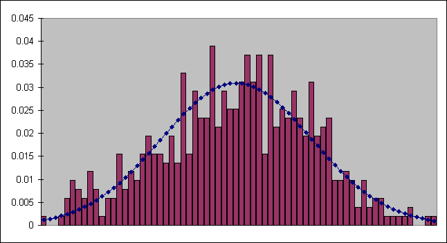
This one is difficult, but will provide you a very nice visualization of how your data compares to the normal curve.Create a custom chart that shows the histogram of ages and the normal distribution. Follow these steps:
- Calculate a histogram using a bin size of 1. Your bins will thus start at 29 (the minimum age) and go to 96 (the maximum age). Don't enter them all by hand - enter 29 in one cell and then 30 below it. Highlight the two cells and move the mouse to the lower right corner of the two cells until it becomes a fine black cross. Then click and drag the mouse down the column. You will see a small number indicating how far your sequence is going. When you get to 96, stop.
- Use the histogram tool to create frequency counts for each age.
- Calculate percentages for the histogram, as we did for the yellow alert in homework 1.
- Calculate the normal distribution for the ages. To do this, use the NORMDIST function and the mean and standard deviation calculated in the descriptive statistics for age.
- Use the Line-Column custom chart in the chart wizard to plot both the percentages and the normal distribution on the same graph. (Eliminate the gaps between the bars as we did before.)
Your graph should look something like this: